* (restored)
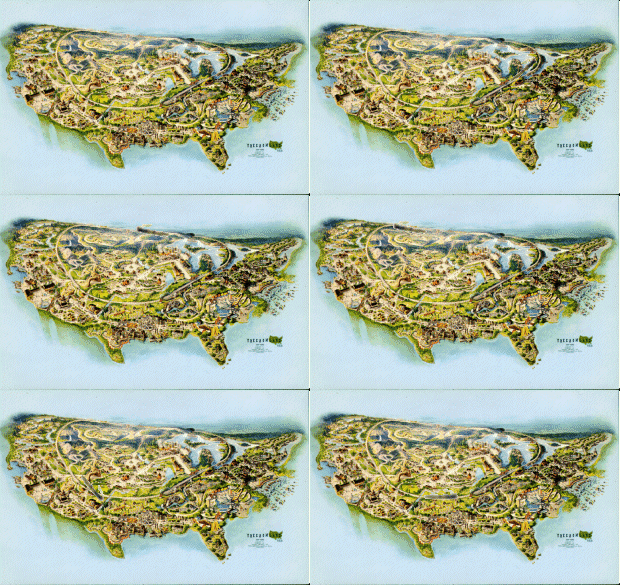
__________________
The World’s Worst Theme Park Guide Maps
‘Theme park maps have to be practical since their primary purpose is navigation. Even beyond just showing pathways, queue entrances, and rides, they have to show and label the locations of restrooms, first aid, guest services, and other necessary structural locations. Even if many park enthusiasts know their favorites like the back of their hand, most visitors actually need the map.
‘So maps are treasure troves of information for the average guest, sure. But they’re best when they’re beautiful. The location of the nearest restroom is important, but tons of visitors collect park maps for their artistic style. Like the parks themselves, they’re idealized and dreamy little miniatures of the wonders within. Maps are like billboards, highlighting key rides and recreating the park’s signature architecture.
‘The best park maps are a balanced blend of style and substance. And when one starts to overcome the other, bad things happen. Here, we’ve got a few examples of maps that either forfeited all practical usefulness to focus on artistic representation, or maps that left any artistic style behind in favor of bland realism.
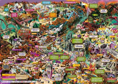
‘Problem: Alton Towers is one complex park. Having grown organically over the last century, the park has expanded and re-adjusted its layout many times as it’s changed, leaving it with a sprawling and sometimes chaotic layout that can defy intuition. The whole thing is made a lot worse by the 2011 park map (above). Finding your way from Point A to Point B may be practically impossible with the confusing and cartoony map. A fine collector’s item if you’re into the style, but not exactly practical.
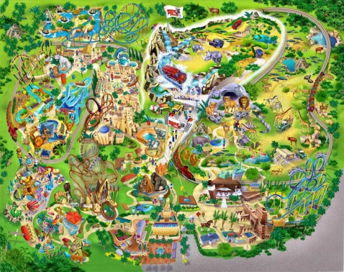
‘Problem: A wave of visual disaster swept across US parks in the early 2000s during which maps became exaggerated, comic-book style representations of parks. Busch Gardens Tampa in Florida was one of the worst offenders, plunging its park map into an outrageous disaster of a situation that looks more like a child’s seek-and-find book than a guide map. With rides and animals co-mingling along twisting and diverging paths, the park map might just induce nausea if you look too long.
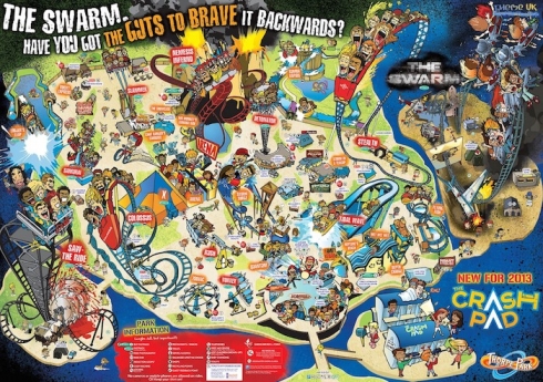
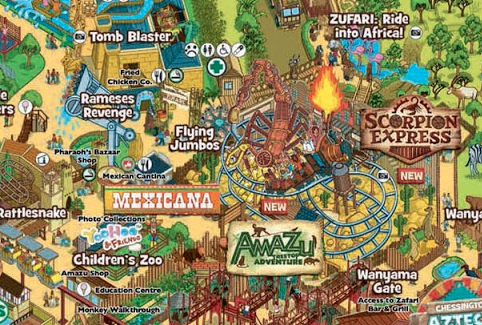
‘Problem: Contained on an island, Thorpe Park has had a most unusual explosion into the public consciousness. Existing as a simple family park with a petting zoo, 3D theater, and collection of family flat rides for decades, the park got supercharged in 2002 under the guidance of Merlin (owners of Alton Towers). Since 2002, the park has added five massive steel coasters and re-branded itself as the nation’s thrill capitol. Maybe, but the 2013 park map did no favors in guiding guests from thrill to thrill. Click the map to open a much larger version, then tell us: Can you spot the vomiting rider? How about the one with his arm cut off?
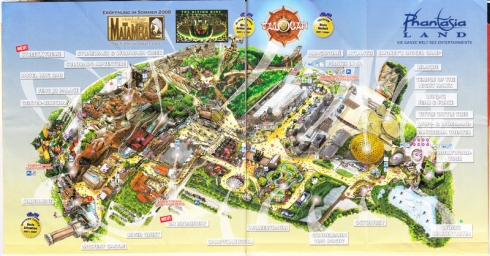
‘Problem: This unfairly overshadowed German park is perhaps one of the most impressive of the parks stuck in Disney’s shadow. Its realistic themed lands and collection of incredible family and thrill rides set it apart and earn it a spot in Europe’s most attended. Problem is that for many years, its park map was practically useless, drawn in a fish-eye orientation that highlighted only a few paths and grouped the park’s many rides into an odd corner.

‘Problem: Like its Floridian, Africa-themed sister, the European-themed Busch Gardens in Virginia has a storied past archive of park maps trying to make sense of its complex layout. The park is located in the dense forests of Williamsburg with extreme climbs, bridges, and very intense stairs connecting its many country-themed lands. In that same unfortunate style of the early 2000s, the park’s map was more comic book than guiding aid. It was full of exaggerated architecture and mangled paths that resemble a seek-and-find book, with little help on how to actually get anywhere or what landmarks might actually look like.’ — themeparktourist.com
_________
Maps of dead parks
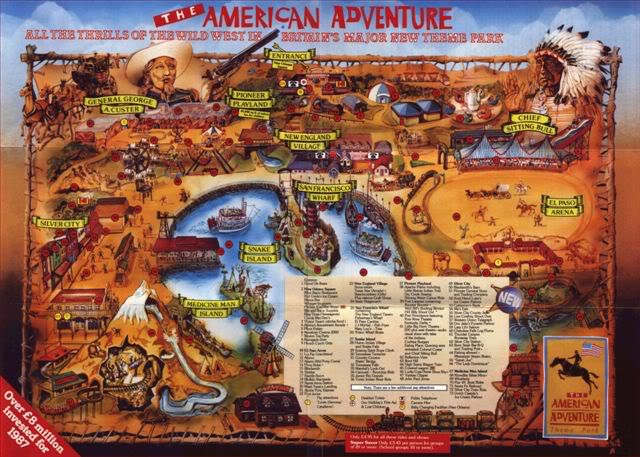
The American Adventure, Derbyshire (1987)
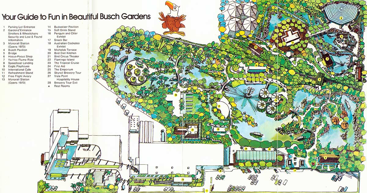
Busch Gardens, Los Angeles (1972)
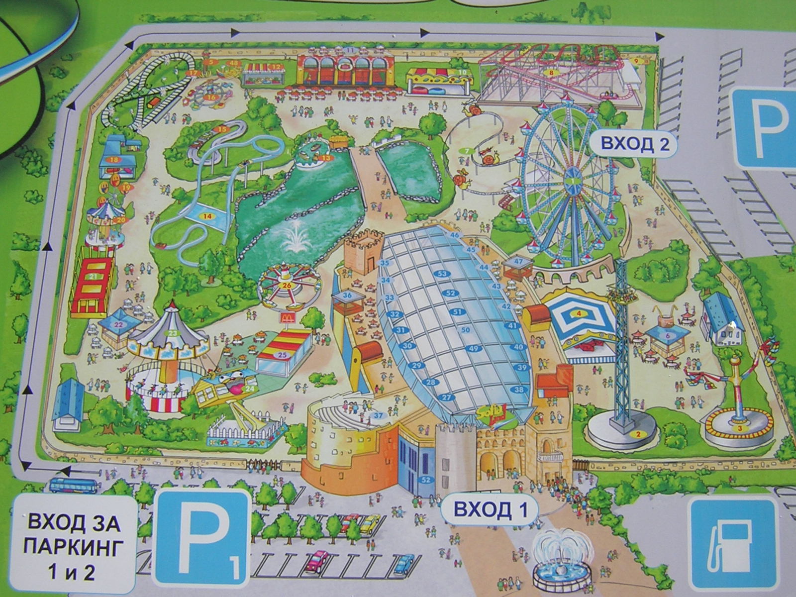
Sofia Land, Sofia, Bulgaria (2003)
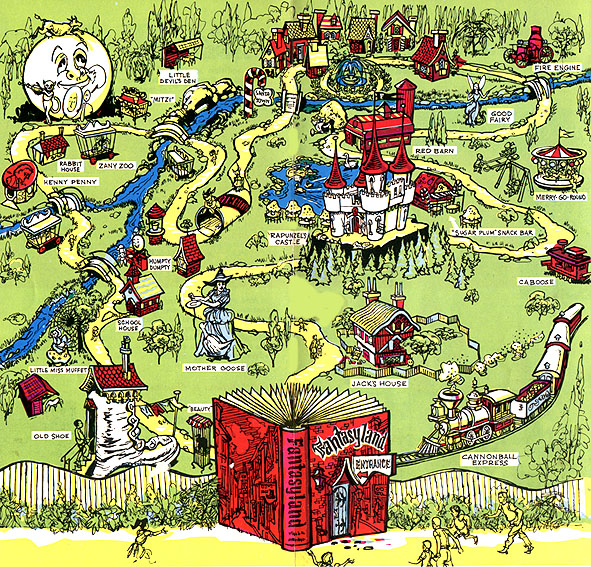
Fantasyland, Gettysburg (1979)

The Great Escape, Lake George, NY (1984)
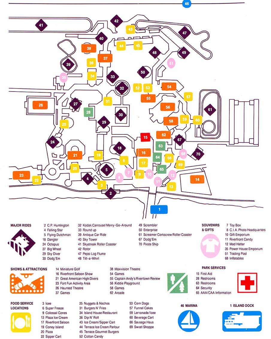
Boblo Island, Detroit (1987)

Worlds of Fun, Kansas City (1989)
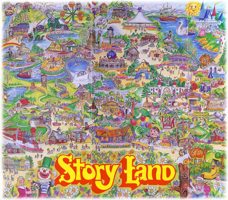
Story Land, Glen, New Hampshire (1990)
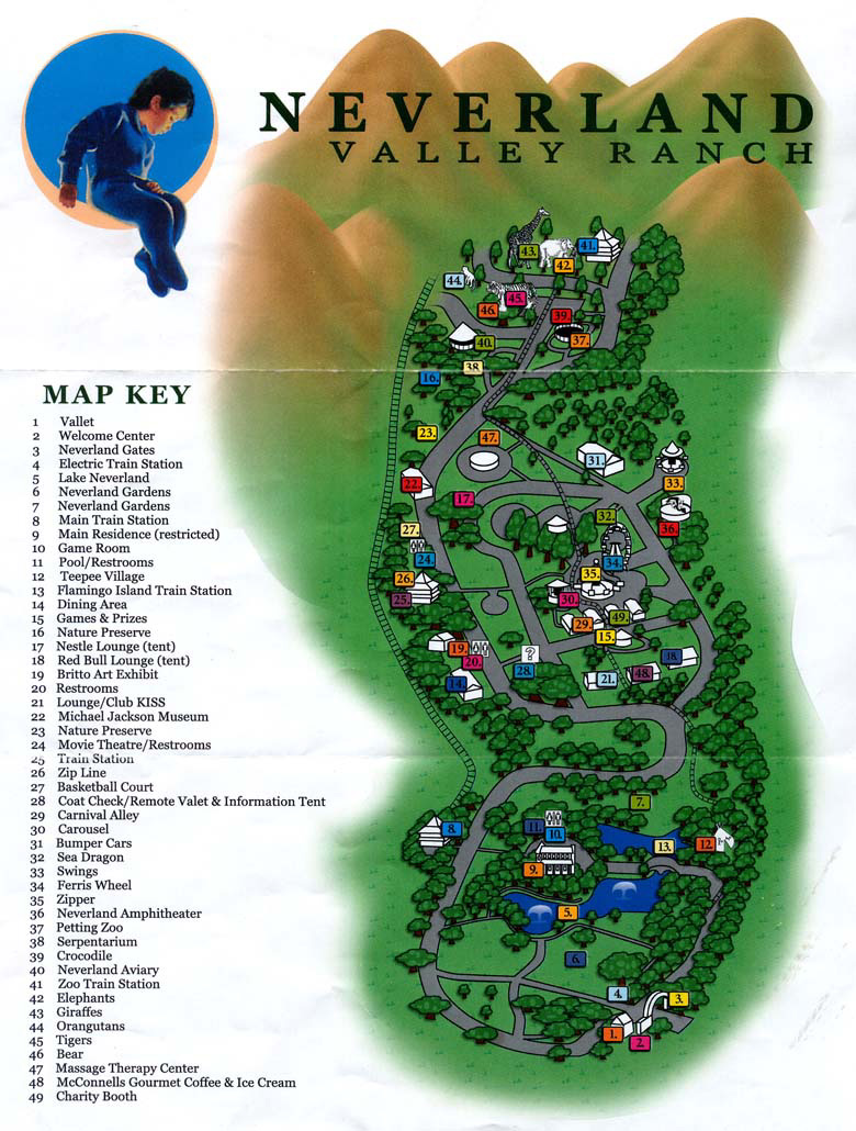
Neverland Ranch, Los Olivos (1990)
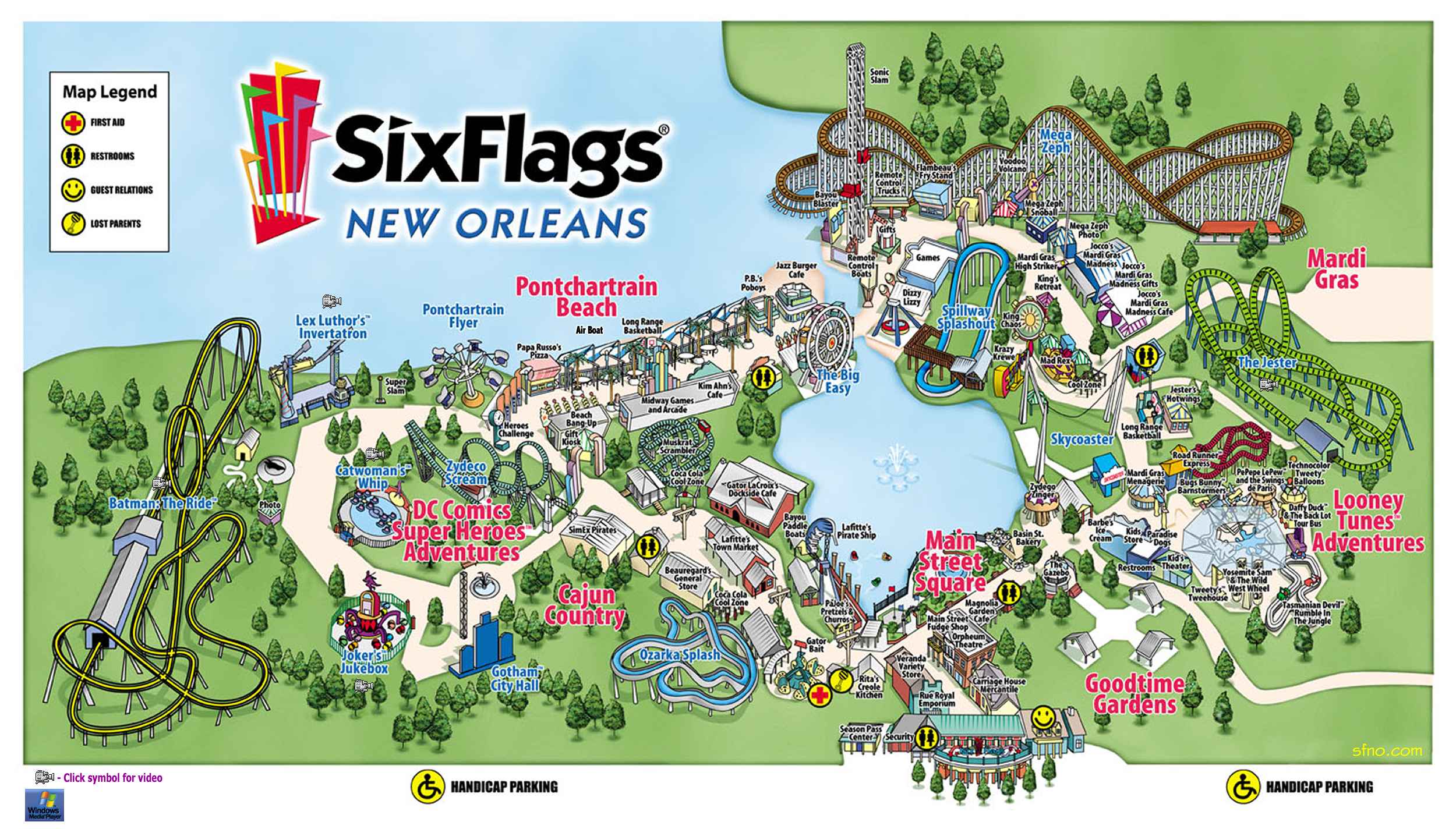
Six Flags New Orleans (2003)
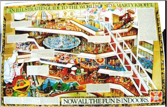
The World of Sid and Marty Krofft, Atlanta (1976)
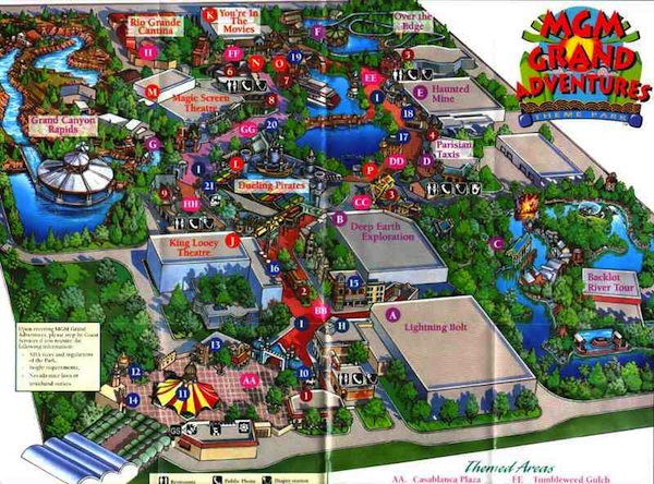
MGM Grand Adventures, Las Vegas (1997)
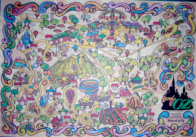
Land of Oz, Beech Mountain, NC (1974)

Opryland USA, Nashville (1987)
__________
A Study into Theme Park Maps: Thorpe Park

‘Thorpe Park is an English theme park established in 1979 which has recently undergone a marketing transformation due to its 1998 purchase by Merlin Entertainments. Prior to the park’s Merlin ownership, the attractions within Thorpe Park were predominantly typical family-friendly attractions; including a farm, educational centre, model museum and a varied selection of rides. However, Merlin Entertainments’ purchase of Thorpe Park in 1998 meant that the company now owned two family-based theme parks within extremely close proximity; as they also own Chessington World of Adventures, located merely 16 miles from Thorpe Park. The two parks needed to distinguish themselves from each other and offer unique experiences to their collective pool of visitors to each maintain popularity.
‘While the changes in Thorpe Park have appeared gradual since 1998; in 2009 Thorpe Park began to apply risky strategies to appeal to a specific audience of thrill seeking young adults. It is an unlikely tactic for a theme park to voluntarily depict itself as being unsuitable for families and children; yet Thorpe Park proceeded in this by building horrific looking attractions based on 18-certificate horror films; and harbouring a collection consisting mostly of intense rollercoasters which young children would not match the height requirements to ride. In 2010, their discouraging mode of address towards families was evident in Thorpe Parks reimagining of the theme park map, which was based upon a Where’s Wally style depiction of teenage debauchery.
‘Interestingly, the self imposed limitation upon Thorpe Parks target audience for 16-34 year olds helped the theme park to grow, as visitor numbers rose to 1.87 million in 2010. Through semiotic analysis of the 2010 Thorpe Park map, we can examine how changes in the map reflect changes in the parks audience; and deconstruct the language of the theme park map to uncover its connotatively veiled issues of audience representation and reality construction.
‘In semiotic analysis of the Thorpe Park map we can uncover the evaluative elements within the text – examining the ways in which its signs and codes contain pre-formed judgements on their interpretants; and how they aim to construct a specific audience appeal through signifying ideologies of youth and pleasure.
‘Roland Barthes theory of ‘Mythology’ is also fitting, as the entire theme park experience is built upon the simulacra of worldwide cultures. Thorpe Park for example, has themed areas with synecdochal signs of particular cultural identities, such as the “Canada Creek” area; wherein the visitor is surrounded by wooden buildings, logs, country music and cowboys; and thus gets immersed in the parks construction of an unrealistic, tourist view through the parks’ stereotypical imagining of Canada.
‘The power of Semiological analysis is that it demonstrates how latent ideologies do not exclusively belong within artefacts of high culture; as, when deconstructed, texts of popular culture can prove themselves to be a goldmine of sociological issues and insights. The theme park map can be viewed as a textualisation of Baudrillards ‘hyperreality’ (1988); in the sense that the signifiers in the map; i.e.: depictions of rollercoasters, are also signifiers, not signified things, within the park itself. For example, Thorpe Parks’ rollercoaster entitled ‘Saw The Ride’ signifies a horror film franchise; based upon simulated experience of a blockbuster film, it “appears to be more true than the real experience” (Eco, 1976); yet the film itself is a simulated experience of macabre torture. Through these constructed layers of simulation it is almost impossible to trace our way back to reality.
‘Several psychoanalytic theories were also applicable in analysis of the Thorpe Park map. For instance, it could be said that the maps depiction of wild, young crowds encourages regressive behaviour – reassuring visitors that it’s ok to act like a child for the day within the confined of the group. Or the violence and blood depicted in the map can be explained using Kleins theory of ‘sadistic phantasy’; as it implores visitors unconscious desires to harm. The exaggerated depictions of the ride attractions, coupled with the grimaced faces of those depicted onboard the ride; create a sense of danger in the experience. The appeal of the dangerous experience could be explained as a manifestation of the “death instinct”, a Freudian concept based upon humans desire to self destruct and return back to an inanimate state.
‘Representation of audience in the Thorpe Park map could be viewed as insulting. The behavioural signs depicted include cartoon images of visitors fornicating behind a bush whilst being spied on by an older man, visitors wetting themselves, being sick, digging graves, flashing, throwing themselves out of windows and drinking alcohol. There are also depictions of violence towards visitors; such as a visitor having his arm ripped off on a rollercoaster, a visitor getting eaten by a shark and a visitor with her hair set on fire. While alluding to the typical sense of teenage debauchery, the behavioural codes are based upon a level of fantasy danger. A rebellious behaviour which often does occur within the park, such as smoking drugs in the queue lines, has tellingly not been depicted. And while it appears on the map that a visitor could throw up or have their arm ripped off on one of the rollercoasters; a more realistic danger, such as brake failure on a rollercoaster , has not been included in the map.
‘In the maps representation of audience; there are only two old people depicted. One is a preacher repenting with a cross beneath a group of teens screaming on a thrill ride; the other is an old man spying on a couple in the bushes. Both characters have an air of desperation to their behaviours and appear out of place. The connotations of these images suggest disagreement and exclusion towards those younger or older than the parks target 16-34 age group. In another form of intertextuality, Thorpe Park was used as a setting for teen comedy TV programme “The Inbetweeners”; wherein the crude sixth form characters went accordingly “nuts at the nations thrill capital”; arguably inspiring plenty of its 16-34 year old audience to do the same.
‘The reality constructed by in codes of the map is not grounded in realistic representation. The images which signify the parks thrill rides are disproportionate; depicting the rides as larger, steeper and in a closer proximity to each other than they really are in the park. These exaggerations don’t just shape the visitors sense of significance toward the thrilling attractions; they also hide the less enchanting reality for visitors of walking around all day to get from one ride to the next.
‘Another real experience of Thorpe Park that isn’t depicted in the map is the long, winding queues for the attractions. This deliberate lack of representation of an imminent part of the theme park experience, is due to the maps function as a souvenir. Visitors can look at the map and be reminded of the fun experiences they had, but not be reminded of the 2 hour long queues they stood in all day. The maps mode of address is also unrealistic in its crass informality; the signs are used to play up to ideas of Thorpe Parks’ bad reputation; and therefore discourage families from visiting. It is, however, assumed that target 16-34 year old visitors will be able to distinguish the difference between the inappropriate behaviours depicted in the map and the appropriate behaviours expected of them whilst in the park.
‘The chaotic semantics of the Thorpe Park map; coupled with its lack of depiction of its car park and surrounding roads; demonstrate a narrative where the visitor is in equilibrium before entering the park; which is then disrupted when the visitor is inside Thorpe Park; then the visitor returns to the equilibrium of the outside world upon leaving the park.’ — Serena Cavalera, coasterforce.com
_________
Growth Maps
Alton Towers
Alton, England
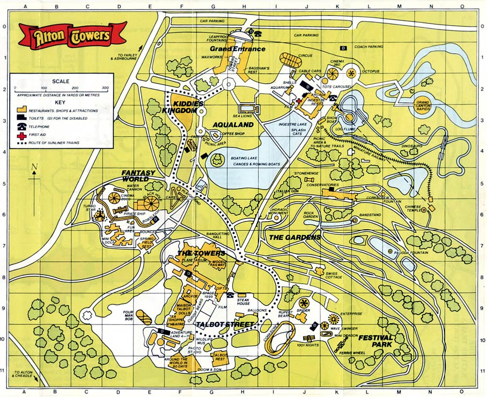
1986
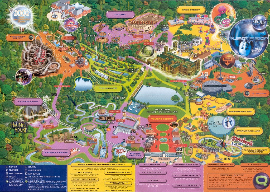
2001
Blackpool Pleasure Beach
Blackpool, England
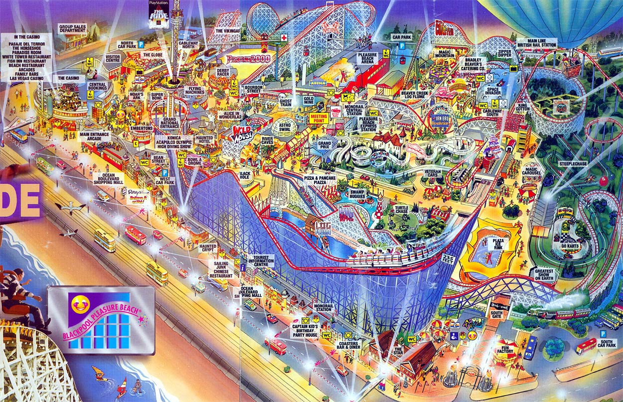
1998

2003
Busch Gardens, The Old Country
Williamsburg, Virginia
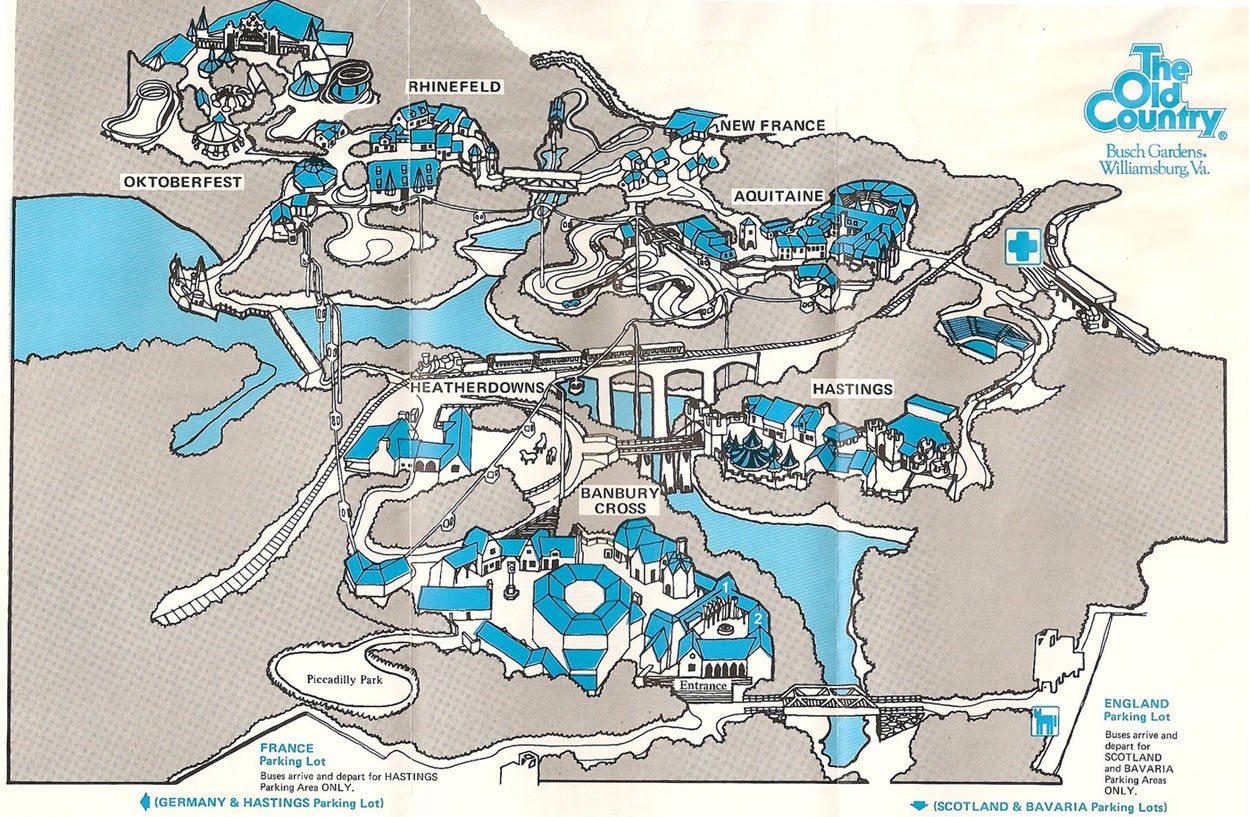
1976
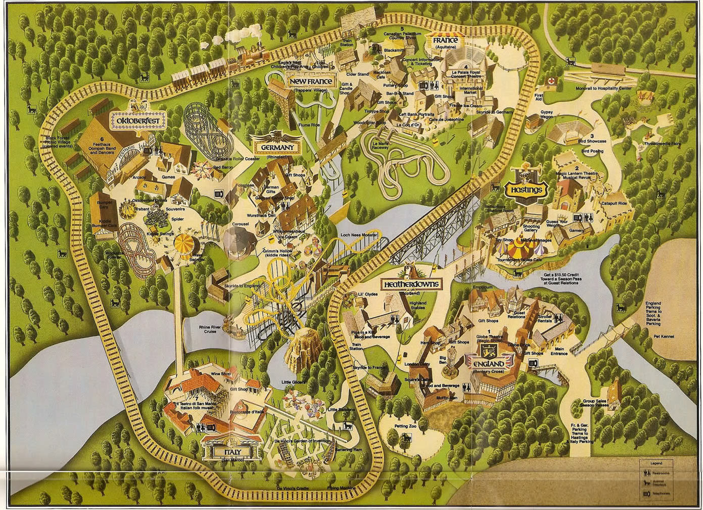
1983
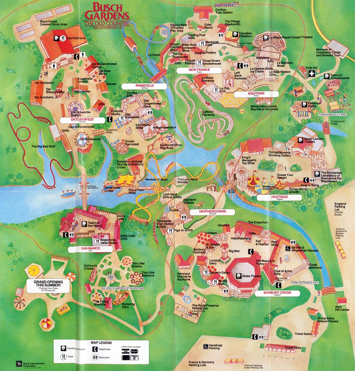
1987
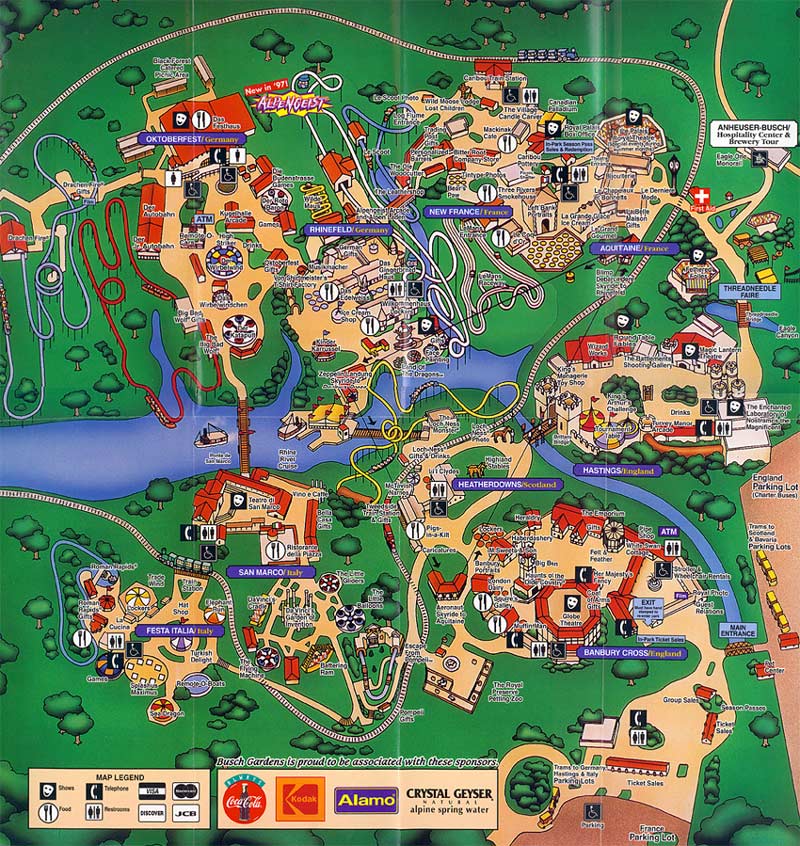
1997
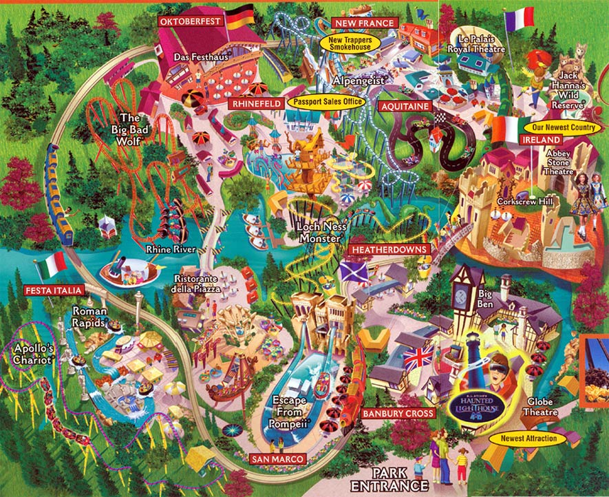
2003
Cedar Point
Sandusky, Ohio
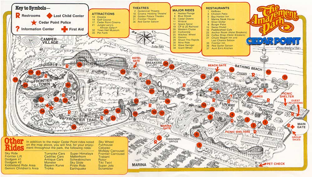
1980
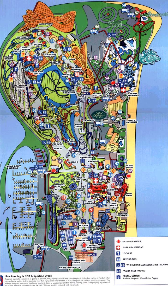
2000

2007

2010
Chessington World of Adventures
Chessington, England
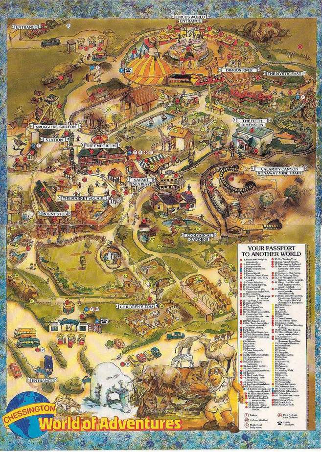
1987
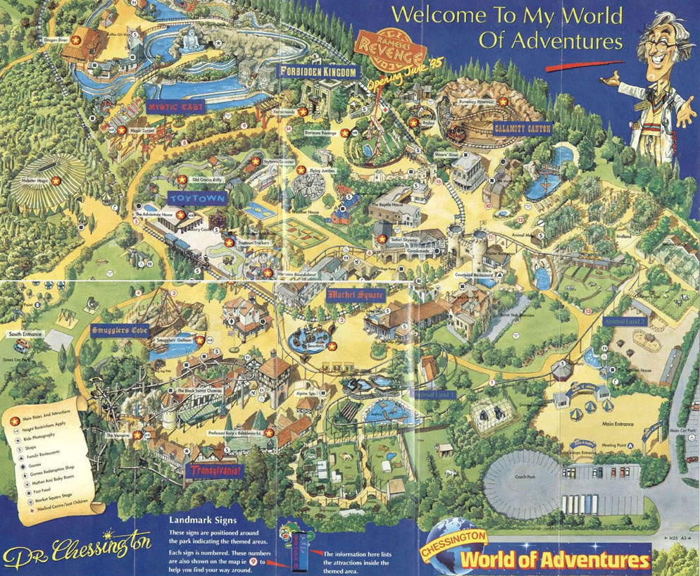
1995
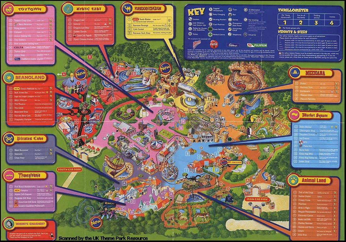
2003
Darien Lake
Darien Center, New York
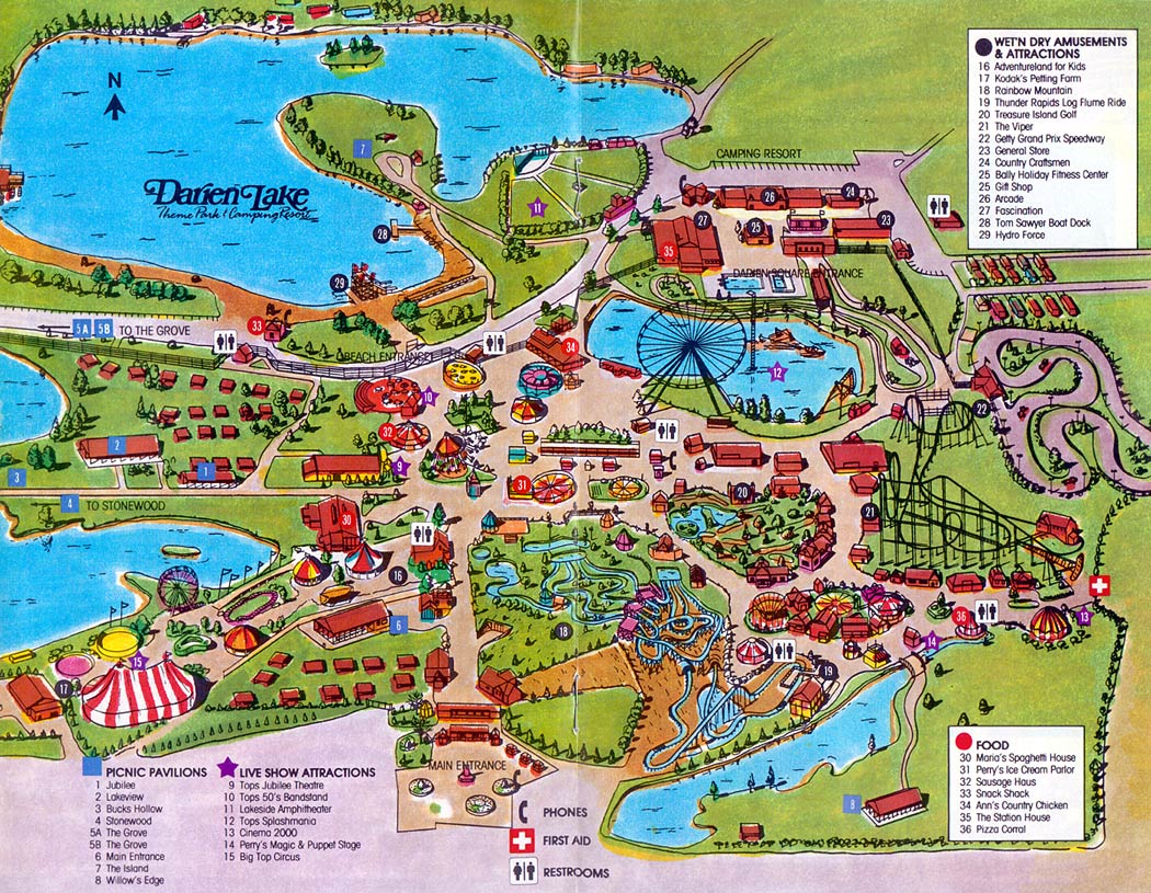
1988
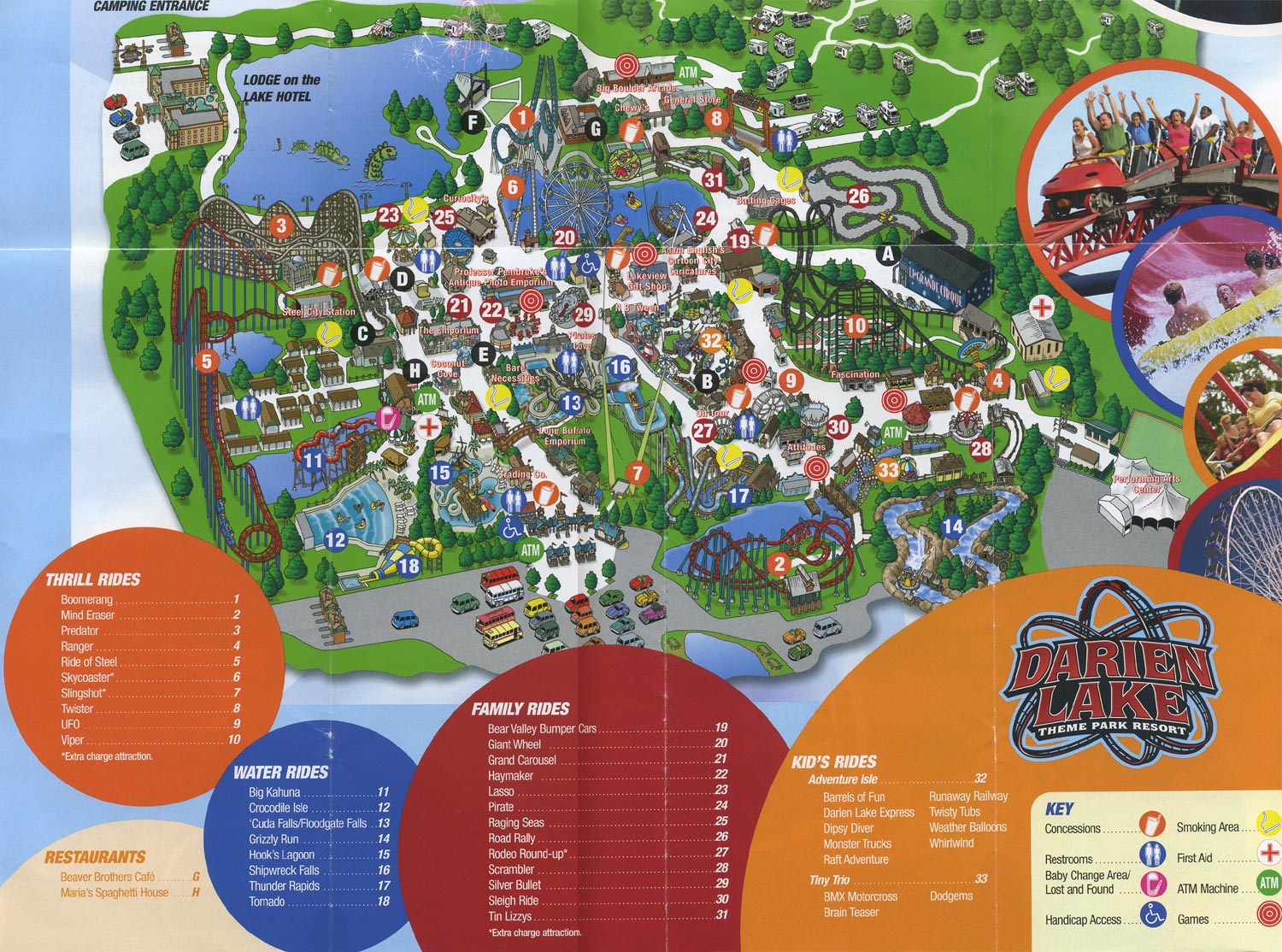
2007
Disneyland
Anaheim, California
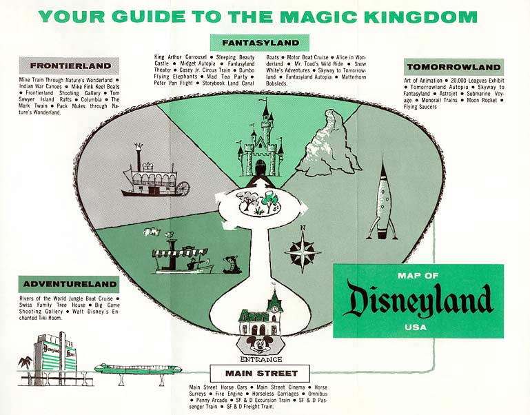
1964

1980

1989
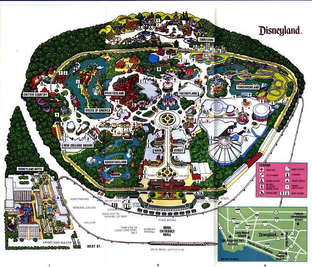
1993

2001

2004
Six Flags Magic Mountain
Valencia, California
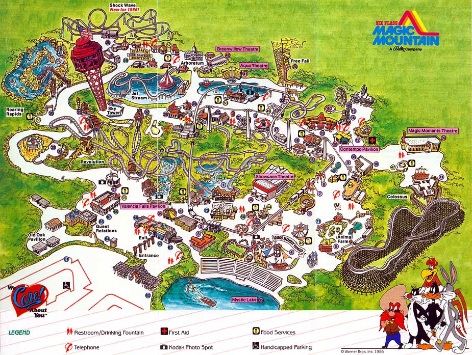
1986

2000

2002
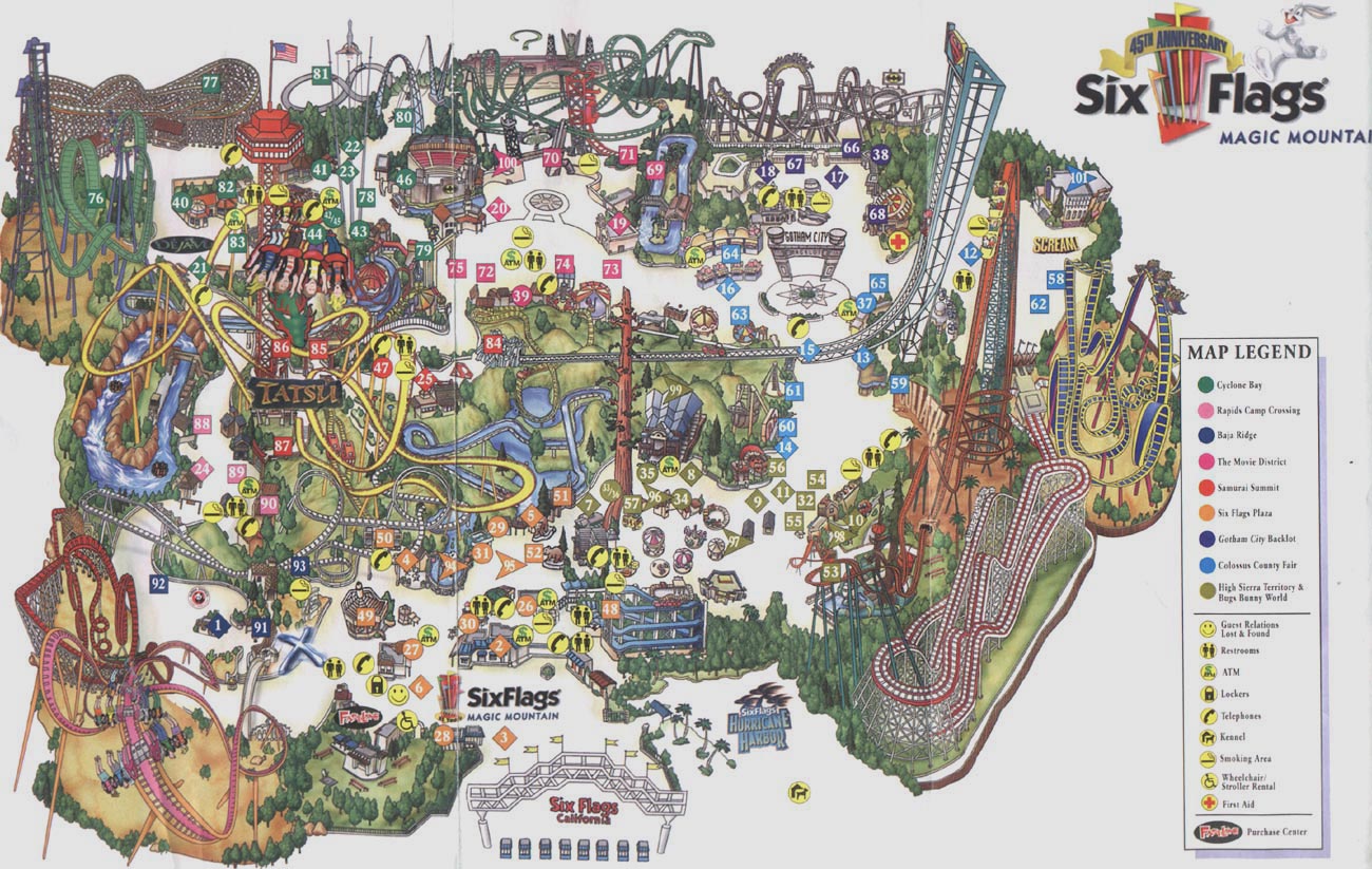
2006
Six Flags Over Texas
Arlington, Texas
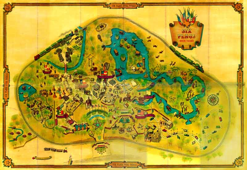
1961

1991

2008
______________
Thoughts on Theme Park Map Design
‘The majority of theme/amusement park guests explore parks naturally without consulting the map. The majority of guests won’t even pick one up in the first place, unless specifically handed one. Of those who do pick them up, most immediately stuff them in their pocket. The map might make an appearance during a queue when the guest is bored. Some people may open the map up to find food outlets, (in fact, I’d wager the majority of guests seeking out a map later in the day are looking for food options) or a toilet and fewer still for directions to a specific attraction. But the majority of guests will ask a member of staff instead of consulting their map, or rely on signposts, because people want instant answers. Besides, most maps are single, large sheets of paper. They feel less like a guide or souvenir and more like your dinner placemat to be disposed of.
‘I’ve worked at a park and that’s what I’ve observed. I’ve been that member of staff bombarded with direction questions. You will rarely see guests around a park with a map open actually using it to navigate, yes it happens occasionally, but it really is quite rare.
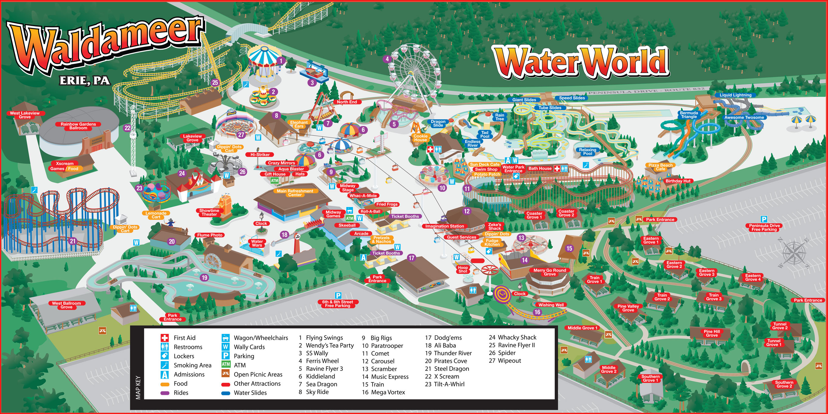
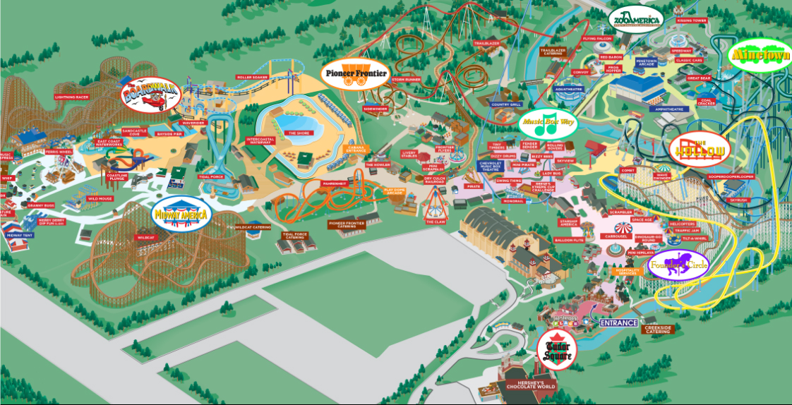
‘A common problem of theme park maps is representing attractions closely together that may well be in real life, but their entrances are far apart. When guests do use the park map for navigation, they don’t follow pathways like with regular maps, they use them to get an idea of the general direction. Even clear maps suffer in this scenario. But by warping the layout, using heavy stylisation and graphics, or by placing the ride’s logo near the actual entrance, you can partially overcome this issue. What I hate about these styled maps is they are just so void of personality. Looking at them fails to excite. How anyone could make a park so crowded and exciting as Hershey look so lifeless and empty is beyond me. It’s a talent, for sure.
‘Alton Towers is well known for it’s complex layout. At around 800 acres, it is the largest theme park in the world, and it’s been brewing a sprawling mess of pathways, foliage, architecture and attractions for well over a century. It’s no surprise then that Alton’s guests have trouble navigating the place and so extremes have been explored attempting to solve that “problem.” Cue a unique and highly stylised map style that lasted a a few seasons and reduced Alton to the bare essentials…
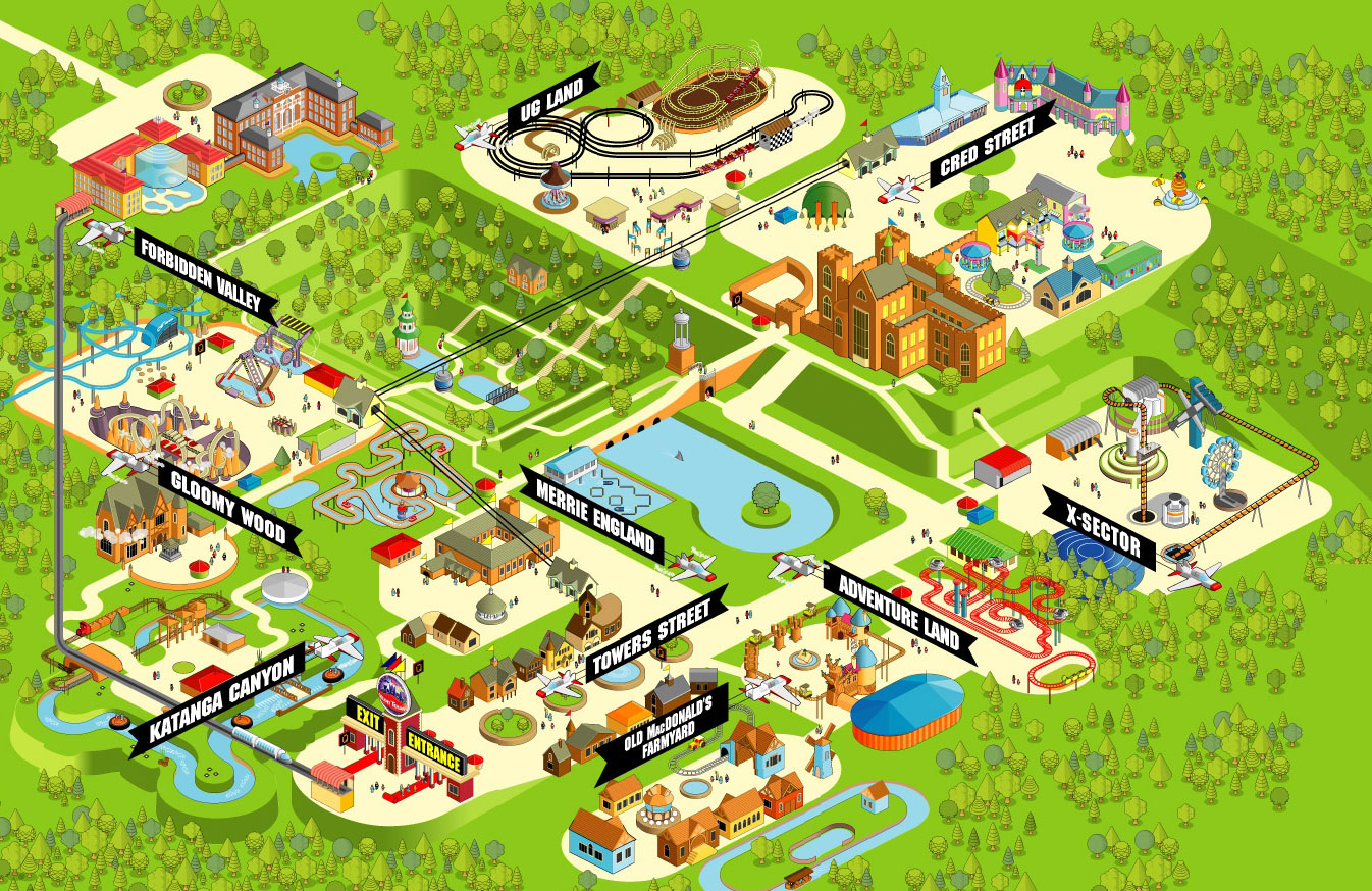
‘The problem with this is that it is so fundamentally out of character. Anyone who’s been to Alton knows how that weird gothic magic feels… It feels like damp, dark woodlands and strange abandoned spaces, not phone Apps for kids. The absolute rejection of Alton’s personality is one thing, but the way in which this map reduces the park to so few attractions is another. It’s reminiscent of faux naive illustration that’s trying to be innovative simply by rejecting a history of of knowledge and understanding. It is my opinion that there was no problem to be solved in the first place and that guests will get “lost” at Alton Towers no matter what map design they’re provided with – firstly because most of them won’t even have a map, secondly because most people are too stubborn and impatient to use one and thirdly because it is a vast space with a maze of paths.
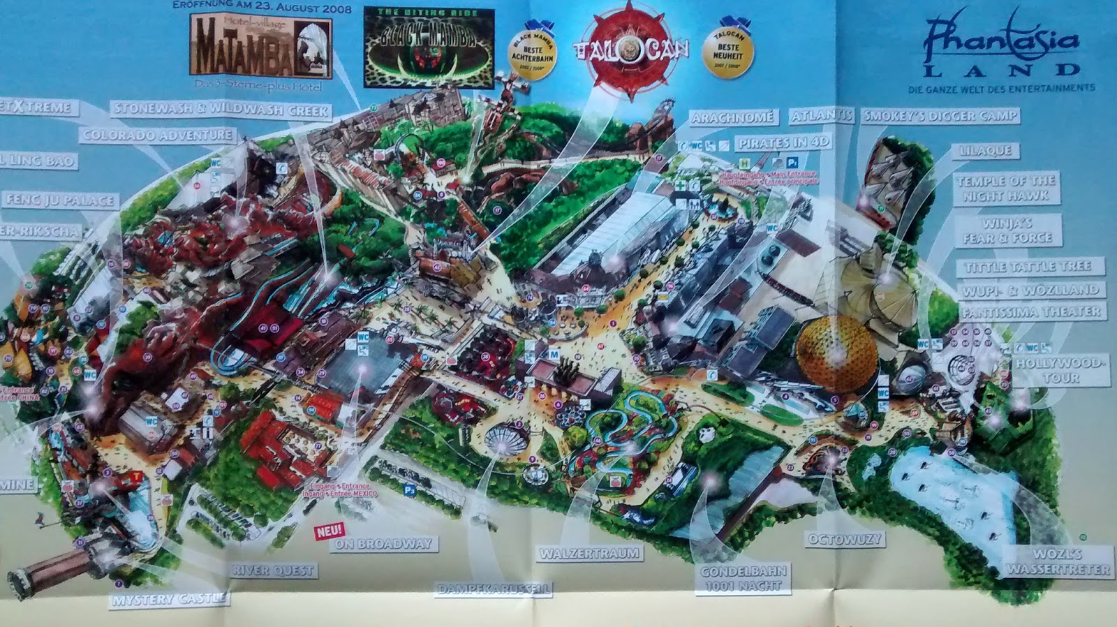
‘Phantasialand is a park made up of narrow streets and tall themed facades. It is, I would argue, the world’s most intense themed environment. I’ve always wondered how a park like this would cope on a very busy day, because the park itself doesn’t feel very large. A very literal, practical map is kind of required with Phantasialand’s network of streets and quirky attractions. Instead, it has an unusual and beautiful, but completely useless map that resembles conceptual art more than it does a usable map. The peculiar sketch seemingly drawn in real media fails to show much at all.
‘Maps are not necessary, and they are not used by the majority of guests, but what they are is a convention of a theme park visit. An expected – free – souvenir. They can help to define the brands (the rides and their themes) in a park by giving them illustrative content. That’s why ephemera is special – this tactile thing that usually gets thrown away, but represents memories of a fleeting event. The best maps are those that both stylistically match the atmosphere and brand of the park they represent, and successfully provide visual and written information about the many attractions and facilities within. Navigation is not their primary purpose.’ — Theme Park Thoughts
______________
Maps to Imaginary Theme Parks
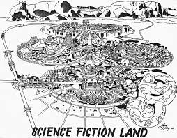
Science Fiction Land
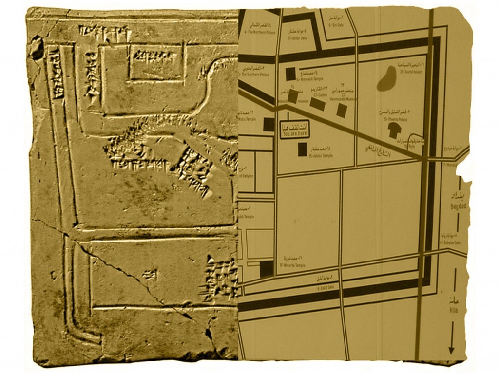
Babylon Theme Park
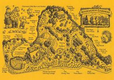
Bookworm Gardens
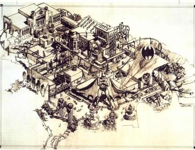
Gotham City Batman Park

Chichi Jima
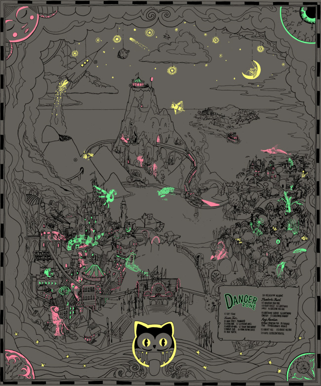
Danger Zone
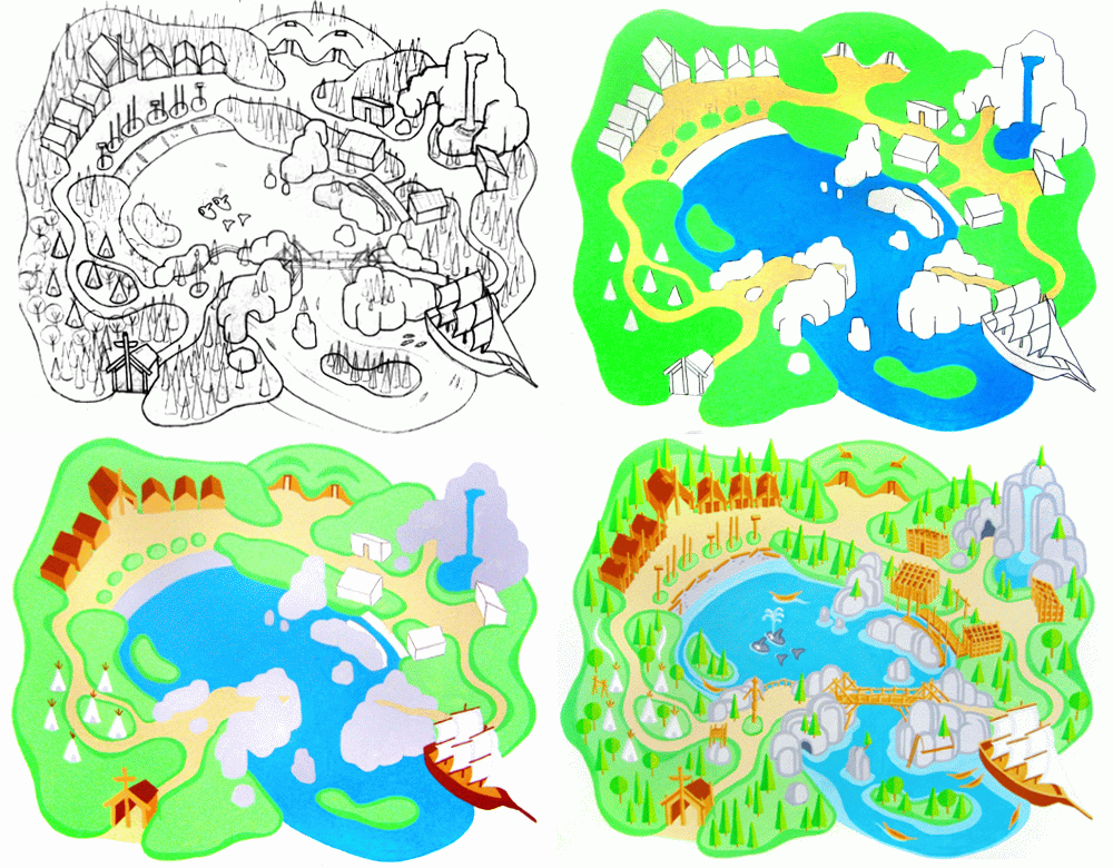
First Nations Theme Park
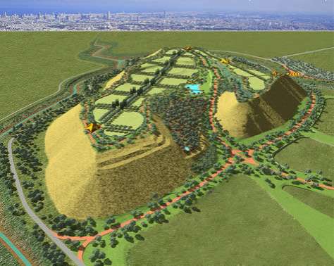
Garbage Dump Theme Park
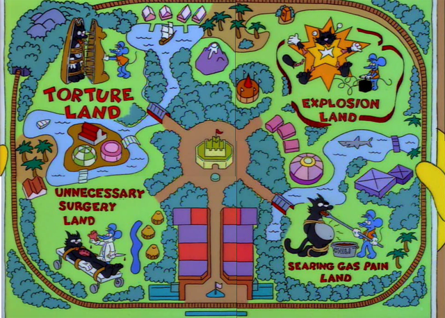
Itchy and Scratchy Land
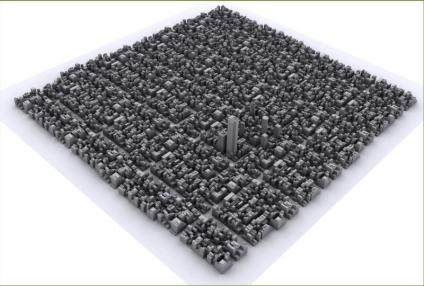
Super London Theme Park
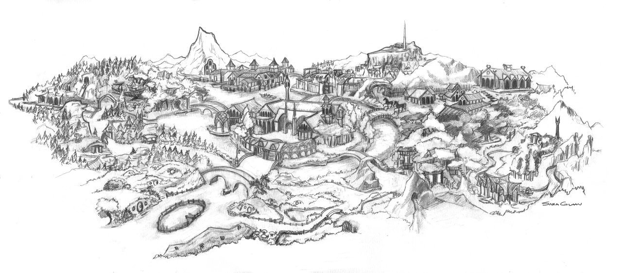
Middle Earth Theme Park
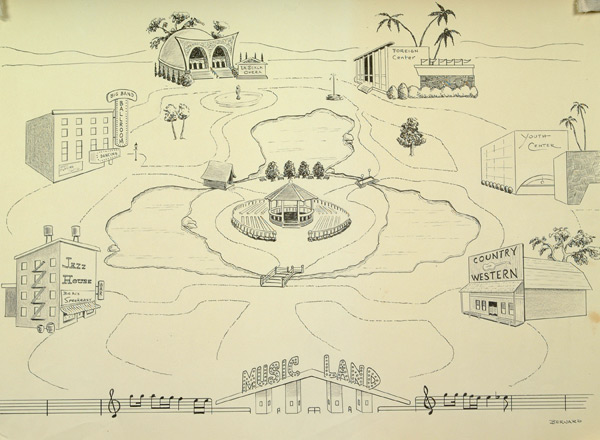
Music Land
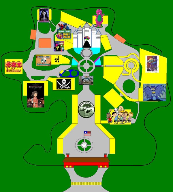
Neverland Kingdom
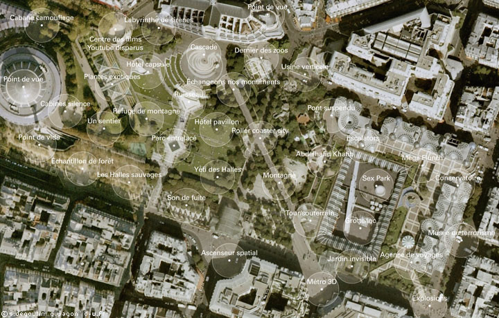
Potential City Theme Park
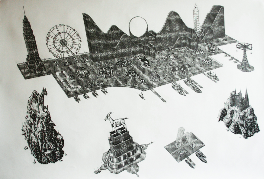
Rik Smits Theme Park
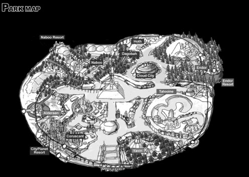
Star Wars Experience Park
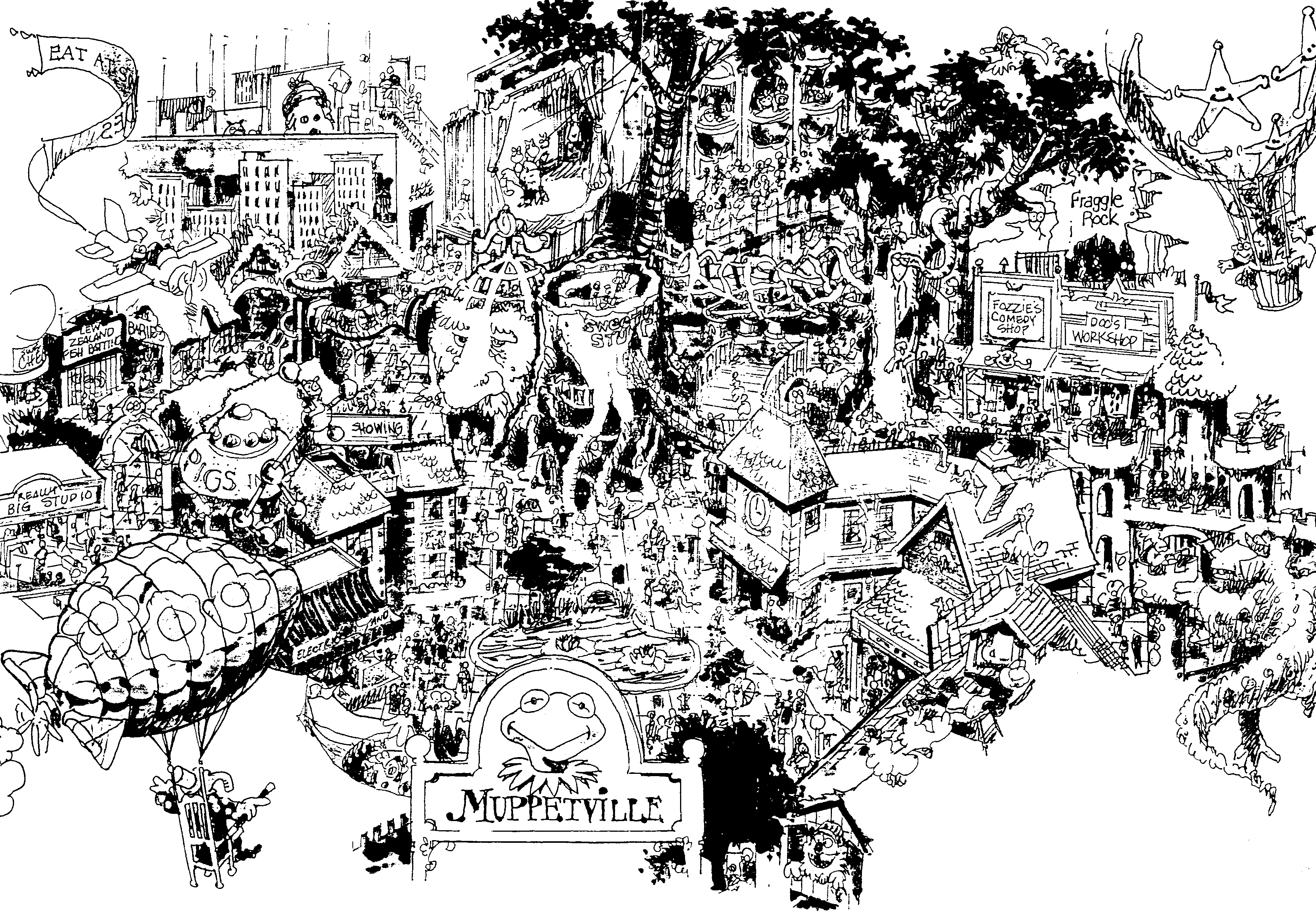
Muppetville
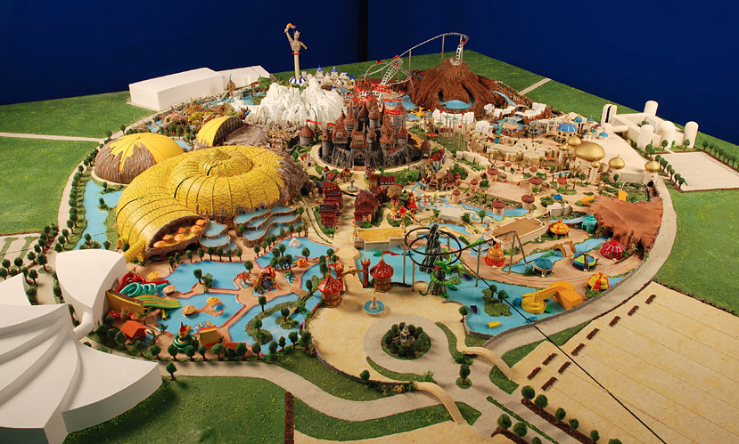
Mystica Theme Park

The Ruin Theme Park
*
p.s. Hey. ** David Ehrenstein, John is the very best! ** Tosh Berman, I agree with your assessment, of course. The French right wing pols are ripe for satire, and they’re constantly parodied, but I think that’s because they act like serious people even when they spout their most hateful rhetoric as opposed to the American variety who tend to be total buffoons even when they’re at their scariest? Thanks, T. ** Misanthrope, Yep, no sign of your missing comments. This blog is like a Vegas magician, and not the David Copperfield type, the type doing their act on the tiny stages in the corners of off-Strip casinos. Yes, for a short period, I had a Gibson Les Paul that was pretty wasted in my rather incompetent hands. But still. Hope you got your (and their) taxes done. ** Steve Erickson, Home so often is. Interesting exercise: ferreting out the ‘hits’ among your bevy of songs. I’ll search out the KLF doc somewhere. No, never saw that parody. Yeah, exactly, as I was just sort typing to Tosh. ** Dominik, Hi!!! You’re, of course, very welcome! I always thought the same thing when I used to get avalanched with inappropriate poems and so on at Little Caesar. I used to submit my poems to ‘little magazines’, as they were popularly known back then, when I was starting out as a writer, but not until I’d seen the little magazine with my own eyes and thought what I did might fit in and have a real chance. Strange. Desperation? Plus laziness? Bad combo. I recently came across a guy in my escort searching who was raving about the taste of the dirt under the fingernails of the escort he’d hired. I’d seen guys whose thing was having the escorts blow their noses in their mouths and assessing the flavor of their snot, but that was a first. Love opening a pop up store where, for a small price, you can have the dirt under your toenails replaced with crumbled falafel, G. ** Bill, Hi. Good choices. That RE Katz book is a real charmer and find. My weekend passed in an acceptable manner. The election: Totally predictably, it’s Macron vs. Le Pen in the finals. Depressing rerun of last time. The really sad thing is that the far left candidate, Melenchon, came within 2 points of beating Le Pen. He’s an arrogant asshole, and the only reason he got that close is because people on the general left, including most everyone I know, voted for him strategically even though they hate him because he was the only left candidate with a realistic shot. And if it hadn’t been Melenchon but some actually cool, interesting candidate who people voted for enthusiastically rather than begrudgingly, he very likely would have passed Le Pen and been in the finals. So that kind of really, really sucks. ** _Black_Acrylic, It’s fun. Oh, jeez, man, I do so hope you get your screen back any second, and not just because I need my PT fix, trust me. Repair vibes, me. ** rafe, Oh, good, I’m so happy you tore through ‘The Book of Lies’. And Gladman is one of my favorites. Barring a complete shock, Macron will win. What extremely sucks is that so many people are going to have to make themselves vote for him only to defeat Le Pen. Again. And, believe me, he is not an easy guy to vote for. But one of the things I admire about the French, to speak (too) generally, is that, in situations like this, they become selfless and do what’s best for everyone without too much whining. A little whining, but mostly quite stoically. Happy Monday! ** Right. I think today’s post is almost certainly the geekiest, least popularly appealing post I ever made in the history of this blog, and that’s the very reason I thought, Bring it back! Weird me. Meet your fates within, and I will see you tomorrow.


 Now available in North America
“Science Fiction Land” sounds delightful Perfect spot for dating an alien.
Or a Republican
Dennis, Yeah, got all the taxes done. David’s cost me $240 to get done, though. He had the Door Dash and then a regular job, so a W-2 and a 1099-NEC. Ugh. He’s getting $6 back, haha. But not really haha, because it helps me in no way. Or my mom. Or Kayla. Erf.
I really need to get back on my guitar. I haven’t really lost interest or anything, but I get so much going on throughout the week that I just don’t have time. I can make time, I guess. Just squeeze all that shit in there.
I like the one with the tagline ‘Now all the fun is indoors.’ Seems appropriately and strangely threatening.
That Renee Gladman book looks like a must have and I really liked the style of And then the Gray Heaven.
I’ve just finished reading Olga Ravn’s ‘the employees’ which was really great and maybe the first really …experimental?… stylistically foregrounded ?… science fiction novel I’ve come across…like the genre is entirely technical? I don’t know. It was fantastic anyway
That and Hurricane Season by Fernanda Melchor have been the two best things i’ve read recently
I do not share your longtime theme park obsession but enjoyed this day the first time round, and still get a nerdy kick out of it now.
My computer screen is miraculously working ok right now, so Play Therapy was recorded this morning while there was chance. Was also able to sign up for the new flat so it’s been a productive day, albeit one held together by masking tape and bits of string.
Hi!!
Right? I submitted a few pieces here and there as well, but always to sites/publications I actually knew and found fitting. Desperation and laziness are indeed a pretty unfortunate combination.
Okay, ew. Ew. Haha. When I sent you my weekend love, I didn’t actually think too hard about any potential kinks related to fingernail dirt – let alone snot! I’d visit your love’s pop-up store, though – strictly in secret – because… you know, crumbled falafel. Who wouldn’t? Thank you! Love working at Starbucks and writing Dennis on everybody’s cups, irrespective of their real name, Od.
Hi Dennis. I adore your theme park posts. I remember studying the oddly-proportioned map of Six Flag Over Mid America (now Six Flags St. Louis) when I was a kid and failing to make heads or tails of it.
Responding to your message from a couple days ago: Things are good but quite busy. In addition to my Snopek doc, I’ve also been working on a horror feature that sort of came out of nowhere. I live in a pretty rural area, and there’s a lot of really cheap property here. My wife and I recently bought this run-down old duplex that we intend to fix up and use as a sort of DIY movie studio. Its current, run-down existence is also charmingly cinematic, so we decided to shoot a semi-improvisatory found footage ghost story there before fixing it up. We were in a rush to finish shooting the bulk of that before winter ended, so now we’re also editing that.
You mentioned investigating Sigmund Snopek. If you’re interested, I can email you links to the parts of the documentary that I’ve already finished. I’d love to hear your thoughts on it!
Maps, in general, are incredible. But today’s maps are extraordinary. Whenever I work on a book/story/essay/script, I always look at a map to get me going. It doesn’t have to be a detailed map, but I’m really taken by the drawing itself. Also, I love google maps. It’s incredible that if I had an address, I could thoroughly investigate that neighborhood. Technology is amazing, but the old-fashioned map has its charm and beauty.
Democracy is very odd that one can’t always vote for the person they have passion for. In my life, I have consistently voted for the lesser evil. The whole structure is based on ‘voting for the lesser evil.” it’s a crappy system, that’s for sure, but on the other hand, people like Le Pen are no joke. She’s a horrific spirit, and if she wins, that will be bad not only for France but for Europe, including the United States.
That Ruin Theme Park map is very fine. So it’s a park devoted to ruins?
Another lefty American friend who has lived in Paris for decades was also dismayed with Melenchon. Hope the Socialists get their act together soon…
Got work done over the weekend, and enjoyed some good weather. A good combination.
Bill
Bill
Hey Dennis! Been a while since I’ve left a comment here… These are all pretty fucking delightful, I can’t pick a fave. That earliest, minimal Disneyland one is kind of crazy to me, since I imagine it as this enormous sprawling place (I’ve never been), but maybe not originally? Or I dunno, maybe the map only has the main stuff on there. Serena Cavalera’s in depth analysis of the semiotics of Thorpe Park was much appreciated too. How’s life ticking up central? I think I saw on here that you managed to get the DP you were hoping for the film? Big yay from me if so. Oh, and for tomorrow, well, today I have somehow managed to get grape-sized blisters on the soles of both my feet, so I’m selfishly going to wish you a Tuesday that’s like an armchair fully kitted out with a battery motor for all transportation needs, xT
Man I’m such a map lover. These rule. I’m sure at some point I mentioned that our 8th grade class was the first that didn’t get to go to Six Flags, instead we had to see Cats. The previous class caused a ruckus at the park. I must admit some of those cats were pretty sexy but not enough to send me down the furry hole.
It snowed a lot today, in April! So dumb. Oh and a poem of mine came out. It’s a true story!
https://www.theelevationreview.com/laurence-lillvik
Take care!
-L
How did Melenchon become the most prominent and powerful French politician on the left? I have not read a single word of praise for him anywhere.
Ah, Dennis… thanks for your kindness. Your blog just kind of disappears from time to time when I try to read through any given post, like magic tricks. You’re aware of that, I‘m sure. Still, I try to read it when I have free moments.
I would like to say, congratulations to L@rst for his newest publication… wishing him well. And to you, I wish you all well. It seems like life restarted when the masks here came off and the Covid certificates were left at the curb, only for an immediate plunge into more war fuckery and personal loss and crisis on the heels of it. No one really catches a break. It’s what we manage to do in the little breaths between that keep us standing. I send you my best hopes for France politically, „best“ being a weak adjective, given the choice again. Love from Switzerland.