
‘Leslie Thornton has long been considered a pioneer of contemporary media aesthetics, working at the borders and limits of cinema, video and digital media. Such seminal works as her ongoing series Peggy and Fred in Hell (1985- ) operate in the interstices between various media-forms, often using simultaneous, interacting projections of film and video to address both the architectural spaces of media, and the imaginary spaces of the spectator’s involvement. Thornton uses the process of production as an explorative process, a collective endeavor “position(ing) the viewer as an active reader, not a consumer.” She is a contemporary of such fellow explorers as Chris Marker, Chantal Akerman, Gary Hill, Michael Snow, Alan Sondheim and Harun Farocki, all artists who are opening up new spaces for media, re-mapping its boundaries within the projective spaces of the museum or gallery as well as within the public spaces of the cinema, television and internet transmission. Thornton’s career to date has been a unique and unusual one. She was one of the first artists to bridge the boundaries between cinema and video, to explore their complicities and resistances, and to embrace their differences as positive, and even complementary, attributes. Thornton’s complex articulations are both edifying innovations in media form and content and tacit deconstructions of the principles, presumptions and promises of technically reproducible artworks. Her projects are ongoing and provisional, and she had been unafraid to return to, and rework, and rethink, issues, topics, subjects. Her works have had a profound impact, and an enduring influence on an entire generation of media artists, critics and theorists.
‘”Her work found its first location, and inspiration, in what in those times was understood as an ‘avant-garde’ film practice; the quoted term, suspiciously suspended, is rarely invoked in these times, but the rigor, the pure oppositional avowal, and the belief in moving imagery’s electro-shock potential evinced in her work insist on its essence and instincts to be one with those of what now seems undeniable as the classical genius of, first, American, and second, transnational, non-industrial cinema, in the questioning, ransacking mode familiar since having filled one of the spaces left vacant (gaping) after modernism moved away from here.” — Bill Horrigan
‘One of Leslie Thornton’s earliest interests was mathematics, a fascination that was encouraged by her father Gunnar Thornton, a nuclear physicist and engineer, and her grandfather, an electrical engineer. During the Second World War both men had–unbeknownst to each other–worked on the Manhattan Project, the top secret development of the atomic bomb. Gunnar Thornton was one of the youngest scientists working on the project. He had determined, while still a student, that an important new frontier in scientific research was probably well underway, and that it would be his chosen area of research. His professors at Harvard were evasive or noncommittal, but inference and persistence paid off, and Gunnar Thornton was brought into the project early on. His father, Jens Thornton, was the electrical engineer whose task had been to design the electrical plant at Oak Ridge where the methods of refining radioactive materials were developed. It wasn’t until after the cessation of hostilities that the men discovered–through an article in a local Boston newspaper–that they had both been working on the Manhattan Project. “I had always wondered,” remarked a family member, “why, for a couple of years, these two men, who were so passionately involved in science, only talked to each other about sports when they were home, a topic they weren’t even very much interested in.”
‘Perhaps it is within this context that, even as a child, Leslie Thornton began to develop certain insights regarding technology and ethics, language and silence, and a sensitivity and attentiveness to the contradictions, ironies, and ambivalences between localized actions and global events. How was it possible to reconcile the brilliant, gentle man she loved and admired with the revelation of the consequences that ensued in the aftermath of Hiroshima and Nagasaki? Both images are true: he, Gunnar, was a man of character and ethics, who believed in the peaceful development of atomic energy, yet whose work had played a role in the shaping of an anxious and dangerous future. Thornton’s dark and magisterial Peggy and Fred in Hell, in its strange divarications between promissory terror and transcendence, might be read as a profound examination of the tropologies of cold-war apocalyptics, the vicissitudes of conflicting narratives, and what one might call a certain paratactics of the image. Peggy and Fred in Hell charts a troubled trajectory between event and mediation, with a profound skepticism throughout concerning the favored foregroundings of technical modernity: photography’s verisimilitude and the index of the photo-chemical trace as guarantor of the real, the consequent presumption of a privileged link to the true and actual, and the promise of recuperability through ever-extenuating forms of technical reproducibility. She finds suspect the naturalization of prosthetic instruments, and the political interests behind certain orders of narratological closure. Thornton has an almost tragic sense of loss, of what is incommensurate in technologies of the image, of the impossibilities and aporias circumscribed by language and in media, a sense of what is profoundly irrecuperable and inconsumable. And a very strange relation to cinema, its histories and practices.
‘Recently Thornton has begun making larger scale installations related to Peggy and Fred in Hell, which she refers to as “environments.” Utilizing fragments from already accomplished sections of this work, mixed with newly produced sections from the 30 hours of archived footage she has shot, and with new or found footage, she has constructed a series of site-specific works. Using multiple screens and transmissions, they are a natural development of Peggy and Fred in Hell, which used simultaneous interacting film video and audio projections, which forgrounded their habitation of specific spaces. In these recent media installations she uses three registers (precisely edited loops of differing durations) which are ‘mixed,’ almost as one would music, producing a resonant three-month-long para-narrative work. The different loops are precisely edited and set to play in a randomized phase pattern so that no repetitions occur between the three registers of images on screen over the course of their exhibition, producing a tacitly self-editing work, an ‘artificial intelligence’ allegorizing itself.
‘Thornton’s exploration of an intermittent episodic structure in Peggy and Fred in Hell, in her site-specific installations, and in The Great Invisible are, in an important sense, one of the most direct articulations of the problematics of media’s artifactuality in confrontation with its forms of transmission, dissemination and distribution. Media’s strange economies, reflecting a globalized and dispersed data-space far different from the traditional projective/consumptive spaces of cinema and television, become an integral axis of Thornton’s formal and conceptual working. Her works are variable, ‘mixed’ and dispersed across time, they punctuate a given architectural space or context, they are permeable and plural, stable within their instabilities. In this they reflect, and engage, a deep substrate of media, one which has always been the case, and which has always been suppressed: that technical reproducibility in and of itself, is both uncontainable and uncontaining, and that, moreover, it becomes, in itself, a structuring principle of subsequent media. As Leslie Thornton is well aware, this does not abnegate what of the world passes through mediation, but inflects and reflects upon that passage in fundamental ways. In this sense her works are also a tacit and critical link between both contemporary digital dataspaces and the tradition of formal, technical, aesthetic, and theoretical innovation within and between media.’ — Thomas Zummer
___
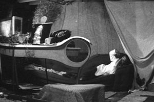
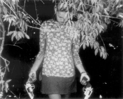
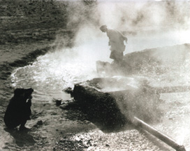
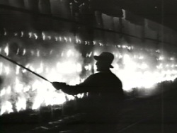
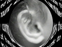
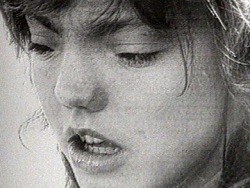
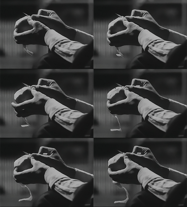
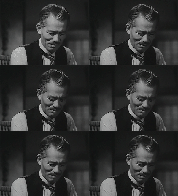
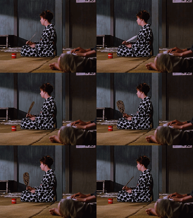
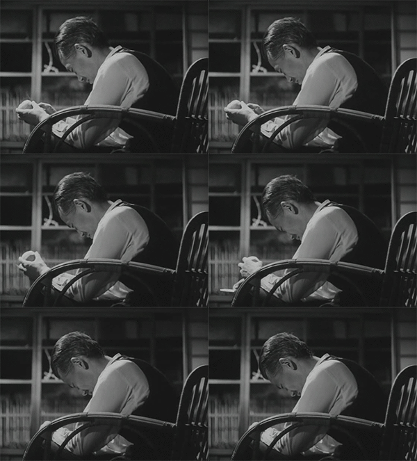
Freeze frames














___
Further
Leslie Thornton @ Senses of Cinema
Leslie Thornton @ Video Data Bank
Video: Leslie Thornton works @ Crane.tv
‘Hell Is for Children: ED HALTER ON LESLIE THORNTON’S PEGGY AND FRED IN HELL’
Leslie Thornton’s films on Ubuweb
‘The Kaleidoscopic Visions of Leslie Thornton’
‘Leslie Thornton by Feliz Lucia Molina’
‘ARTIST IN FOCUS: Leslie Thornton’
Leslie Thornton’s movies on MUBI
‘Leslie Thornton. Aesthetics of uncertainty’
Leslie Thornton @ Strictly Film School
‘Constant Discovery: Leslie Thornton’s ‘Radical Symmetry’’
‘horror film 1: shanghai blue’, by Leslie Thornton
‘For the Hell of It’
‘Worn Story’, by Leslie Thornton
___
Extras
Leslie Thornton. Looking and Seeing: “I Like to Watch”. 2012
Midnight Moment May 2014: Leslie Thornton, Binocular Menagerie
Serpentine Galleries Park Nights 2013: Leslie Thornton & James Richards
Cognac Wellerlane interviews Artist Leslie Thornton at Winkleman Gallery
_____
Interview

Irene Borger: I’ll begin with a quote from you, Leslie. “My own interest is in the outer edge of narrative where we are at the beginning of something else.” What led you, at this time as an art maker, to de-stabilize the narrative?
Leslie Thornton: That grew out of a kind of dislocation for me. The way language works has been a life-long preoccupation, starting in childhood when I was painfully shy and had trouble speaking. The kind of extreme self-focus of shyness, the kind of analysis and appraisal that is nearly constant, and in a way objectifies language, even for a child. Language is something outside. Speech was like an object, an enemy, a barrier. It was externalized. Language was overwhelming, inadequate to describe or convey many things – I had a basic sense of this in childhood. Much later, when I began to study linguistics and also semiotics, I found an intellectualization of something I had already been struggling with – the point being that I didn’t get there through a predominantly intellectual process. Then came more complicated questions about culture and language, how culture is embedded in language. Which led – it’s not a linear process exactly – to concerns about the dynamic nature of any one culture and cultural proximities and crossing-over, change. I think my own estrangement from speech has very much shaped all of my work, and may account for some of its qualities, because it’s deeply rooted emotionally for me.
IB: I’m stuck on this phrase: “to de-stabilize the narrative”. To even question form in the way that you’re interested in is unnerving because it questions a core of the way we learn to think. The reason that [divergence] is so threatening to people is because it doesn’t operate according to the conventional structures or habits of the mind.
LT: Yes, culture as narrative. The mind as narrative. Narrative reflects specific cultural presumptions. Recognizing that, one can’t help but think: then there must be other possibilities for narrative – reflecting other times and places and agendas, past, present, and future. I’m not capable of an involvement in the dominant forms of narrative in cinema, for instance. To study, it feels oppressive and limiting. I choose to be engaged on another, perhaps more critical and intuitive side. But on this other side, there’s a potential for ecstasy that I don’t think you find in conventional forms.
IB: Why is it that ecstasy becomes possible?
LT: It is probably the case that thought is largely structured like language. But, there is a kind of thinking outside of language that can surface sometimes, especially in art-making, probably in a lot of other arenas as well. Intangible, erotic, intuitive, pre-verbal, but precise. Those moments are extremely pleasurable, frightening, or stimulating.
I’ve been reading and thinking about mysticism lately, because of the film I’m working on, The Great Invisible (2002) [about a 19th century woman, Isabelle Eberhardt, who passes herself off as a man and becomes an exalted Sufi in North Africa]. Every form of mystical practice involves techniques for reaching an ecstatic state. However, couched in religious or philosophical terminology, the process is usually body-related and could involve exhaustion, a lot of repetition, a lot of movement, and music or rhythms. One’s physical and psychic environment becomes de-familiarized. I think I use a related strategy in film to produce a heightened experience. I will work with a familiar trope like suspense, or anticipation, and then just keep pushing that button, without the expected next step or resolution. There is a familiar residue of narrative form. The exciting part is then bringing in other elements that aren’t familiar at all but that are saturating to the viewer.
IB: Like what?
LT: Illogical things, mispronunciations, peculiar combinations of sound and image that are somehow startling, excessive beauty. Working with duration that seems inappropriate. The viewer has to deal with it; it stimulates the mind to cope with boredom, for instance. Generally, in culture these discomforts, stimulations, are blocked out; they are not speakable, packageable, or they are disruptive. The closest to transcendence that we get in pop culture might be violence, the lust for violence.
IB: There are many roots into trance-making but there are two poles, even in meditation practice. One is a saturation, the other is the ascetic. In our culture, you seem to be saying, we just use the mode of over-stimulation.
LT: Probably there are similar things going cognitively at either extreme. I’m interested in boredom. My interest comes out of the experience of the most hardcore structuralist films from the ’60s and ’70s. I think these films often produced profound boredom, which forced you somewhere else. None of the artists or critics would ever say that [laughter] but in a way, watching three hours of the camera whirling around in a barren landscape, as in Snow’s La Règion centrale (1971), you have a profound response, if you commit to stay. You feel you’ve had a life-changing experience. A voluntary experience of boredom. The mind becomes very active. All kinds of images and scenarios begin to play. I think of John Cage too.
IB: I was just thinking of him.
LT: There’s a kind of mystical aspect to this.
IB: Are you saying that in your way of making films you’re very conscious of the experiential aspect for the spectator?
LT: I think that’s my main focus. And, as the stand-in spectator, I have to judge by the intensity of my own responses. It’s a thinking and feeling moment, where the thinking and the feeling – we don’t have a word for it – when they can’t be separated. That’s the moment I’m always looking for. It’s not something that comes back to rational formations or very focused arguments or ideas. It’s about a spreading out, spreading and coagulations, chemical reactions in the work that can produce surprising moments and thoughts for the viewer. It’s also important for me that the work not just be addressed to an “enlightened” or experienced audience. I’m trying to make things that are stimulating to watch at the same time that a critical voice is operating.
IB: If people are not used to looking at structures that differ from the beginning/middle/end of the classical Aristotelian scheme, how could they learn to enter your work?
LT: Seeing things more than once helps. Seeing that there is a kind of pattern or structure across several works. Talking about it. Relaxing. Often the people who are having the most difficulty are my colleagues, and not, let’s say, an audience off the street.
IB: Why?
LT: Conflicting agendas or aesthetics. The crowd that bothers me is the visual artists, the art people who don’t get into this kind of work and say they watch films for entertainment only. And the fine arts system that supports one-liner video installations, but can’t deal with anything more complex. Avant-garde film and video take up similar issues to those in the art world, yet there’s very little acknowledgement of this. The film or video work can be more sophisticated, more developed conceptually, yet media remains the most marginalized of the art forms. It’s an orphan. Because media is associated with entertainment and information systems, it’s not perceived as a formal artistic medium. The apparatus per se is limited by the conventions for its use. Photography went through this stage in the 19th century. Experimental media belongs within the history of art. Photographers fought for recognition. I think media artists haven’t done enough to try to change the system, but they are up against something huge. And now the preoccupation with “new” technologies – that has really become the bandwagon. It will take a long time to sort out what’s of value here.
______
Show
Ground, 2020
‘Ground was filmed during Leslie Thornton’s residencies at Caltech (California Institute of Technology) and CERN (European Organization for Nuclear Research), layered atop scenes of a sprawling LA. The voice of a scientist – his body reduced to frequency lines – theatrically narrates his lifelong work at the station. The video centers around his mode of address and the increasing presence of technology in shaping and organizing human thought and perception. An ever-more anxious society is one of the invisible and omnipresent effects of this rapid takeover, countered by the gargantuan machinery that operates technologies. Thornton traces the duality in human advancement and knowledge creation with the inherent disruptive effects on human existence itself.’
Excerpt
Cut from Liquid to Snake, 2018
‘Thornton evokes the instability that humankind acts upon through a combination of several voices – from cold to melancholic to anxious – all at textural odds with one another. An entry point into the work is the artist’s metaphorical use of the Higgs Boson, first encountered during her recent residency at CERN.’
They Were Just People, 2016
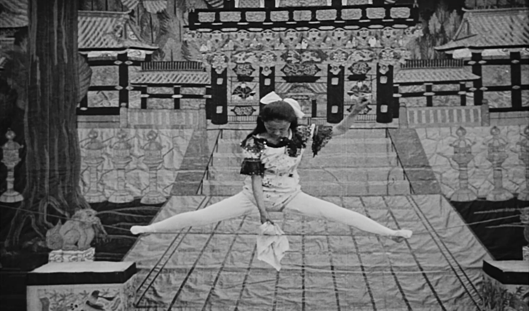
‘They Were Just People is a broad homage to Bruce Conners’ work Crossroads, using an archival recording of an eyewitness account of the atomic bomb dropping on Hiroshima during WWII.’
Excerpt
w/ James Richards Crossing, 2016
‘Richards and Thornton’s collaborative video, Crossing (2016), alludes to Conner’s film in its title. It is collaged from footage the artists had shot but not yet used. The crossings in the work are the intersections in meaning that emerge where their sensibilities overlap. The work is built from ordinary or innocuous images that together obliquely evoke some danger: solarized footage of ants and bodies, tight close-ups of scaly animals, digital kaleidoscope effects.’
Excerpt
Binocular Menagerie, 2014
‘In Binocular Menagerie, Thornton plays with vision, perception and transformation. A series of images of animals—a virtual menagerie of birds, reptiles and mammals—is framed within a format of two circular windows. Each animal’s movements on the left are remapped into an elegant abstraction on the right, transforming the “real” into a digital kaleidoscope. In this unexpectedly profound meditation on the minutiae of perception, the smallest shift in the animal’s movement ripples into resonant motion, multiplied, recast, and folded back upon itself. Thornton’s manipulations intensify the viewer’s focus, offering revelatory ways of seeing and perceiving the ordinary that are both strange and beautiful. Binocular Menagerie premiered as part of the 2014 Midnight Moment Series, a project of Times Square Arts and Times Square Alliance, in which an artist’s work takes over the giant LED billboards in the heart of New York’s Times Square every night for a month, just before midnight.’
Excerpt
Excerpt
LUNA Trance, 2013
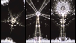
‘”Coined the “Eiffel Tower of Brooklyn,” the legendary Parachute Jump at Coney Island was built in 1939 for the World’s Fair in Queens. In a moving image triptych exploring nature and technology, memory and place, Thornton follows swarming seagulls through three iterations of the same image to her imaginary space—a whole new universe, she’s said, that’s much different from the world we live in.” – Artsy. LUNA is based on a single image of the decommissioned Parachute Jump in Coney Island, with seagulls swarming the structure. The iconic image is digitally re-processed to embody different eras of cinematic and televisual imagery, beginning in 1900 and leading into our present. The artifice of the digital image is accompanied, haunted, by actual (authentic) archival sound recordings spanning the same period, beginning with early Edison recordings. LUNA moves through six variations on a theme, in poetic traces that cross the span of a century.’
Excerpt
Excerpt
The Last Time I Saw Ron, 1994
‘Made in memory of the actor and my friend, Ron Vawter. Ron passed away shortly after the opening performances of the play “Philoktetes Variations,” directed by Jan Ritsema and co-authored by Ritsema and Vawter. It was produced by the Kaaitheater in Brussels. All of the images in this video were originally created for the play.’
Strange Space, 1994
‘Thornton asks viewers to question how one sees “space”—whether literally or figuratively— and what is being revealed? Images of a sonogram session grant viewers access to what is typically reserved for medical analysis—“inner space.” The body, probed and revealed through technology, is collaged with imagery from lunar probes, drawing parallels with how technology also allows us to see where we were previously unable—“outer space.” A poem by Rilke about the interior quality of thought is contrasted with the clinical voice accompanying the images.’
Photography is Easy – Version 2, 2010
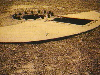
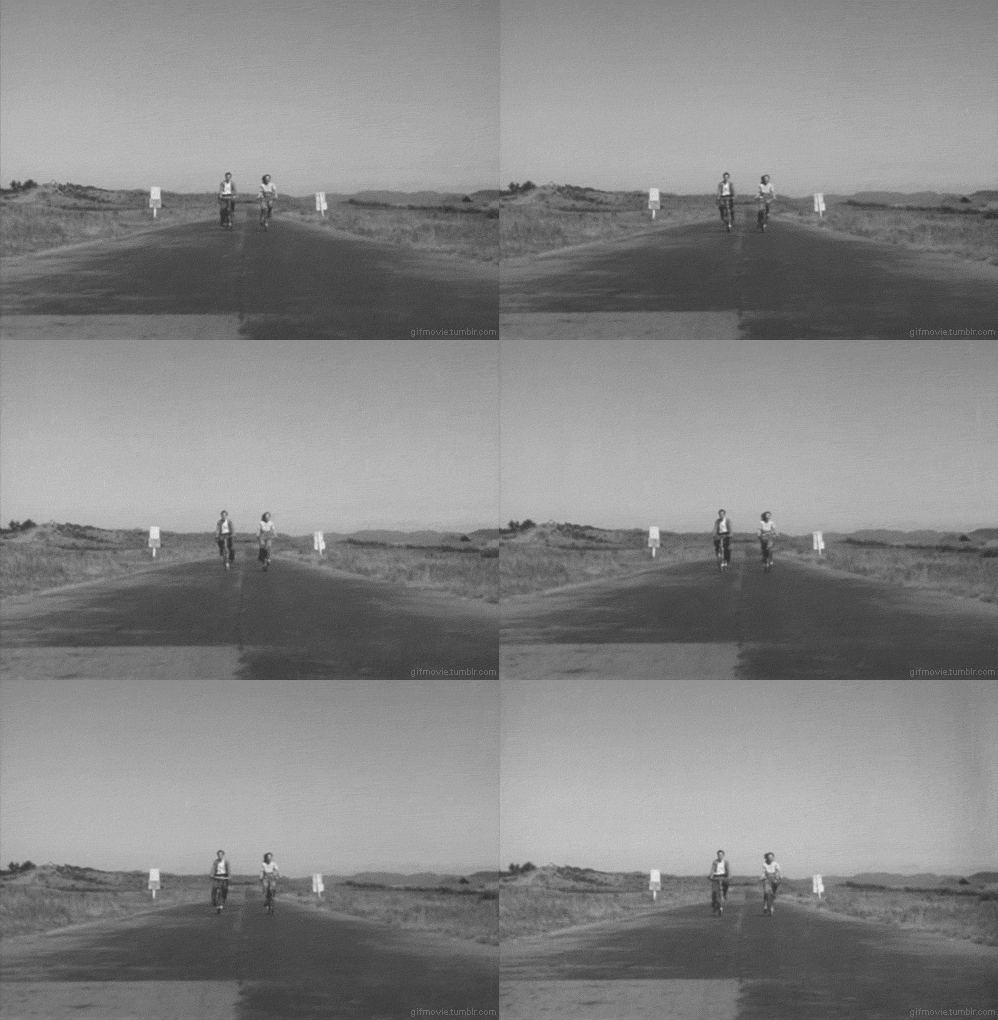
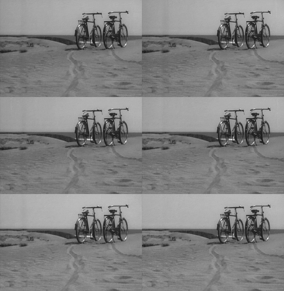
‘In the ongoing project Photography is Easy, Thornton continues her investigation of the production of meaning through media such as photography, film and video. Thornton and a companion are seen hiking through a desert, photographing and recording the journey. Shots of desert landscapes are overlaid with the artist’s running commentary and text about Thornton’s experience of making a photograph. Questioning the value of the rarified image, Thornton investigates the porous boundaries between the still and the moving image.’
Novel City, 2008
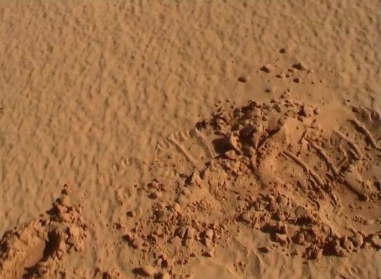
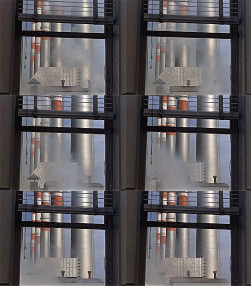
‘In her new work, Thornton confronts the economic and cultural transformation of contemporary China, evoking a new spectacle of capitalism run amok. Thornton shoots from her window of the Jin Jiang Hotel in Shanghai, the site of Mao’s 1972 meeting with Nixon, and projects images from the earlier movie, creating a layered landscape of alienation and dislocation.’
Peggy and Fred Go to Kansas, 1989
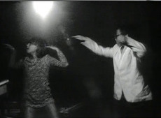
‘Peggy and Fred, sole inhabitants of post-apocalyptic Earth, weather a prairie twister and scavenge for sense and sustenance amid the ruined devices of a ghosted culture. The improvised and playful dialogue of the children provides a key to understanding the tape; their distracted sense of make-believe floats between realities, between acting their parts and doing what they want—patching together identities that, like fidgeting children, refuse to stand still.’
Dung Smoke Enters the Palace, 1989
‘An anti-narrative adventure traveling through a phantasmagoric environment void of stability. The video presents a bizarre compendium of archival and industrial footage accompanied by a noisy soundtrack of music and voices from the past, as if echoing the ether of the viewer’s mind. Thornton’s distinctive visual style of collaging random elements elicits an eerie sense of being lost amidst past and present, breeding a confusion that complicates any clear reading of the image.’ — Video Data Bank

There Was an Unseen Cloud Moving, 1988
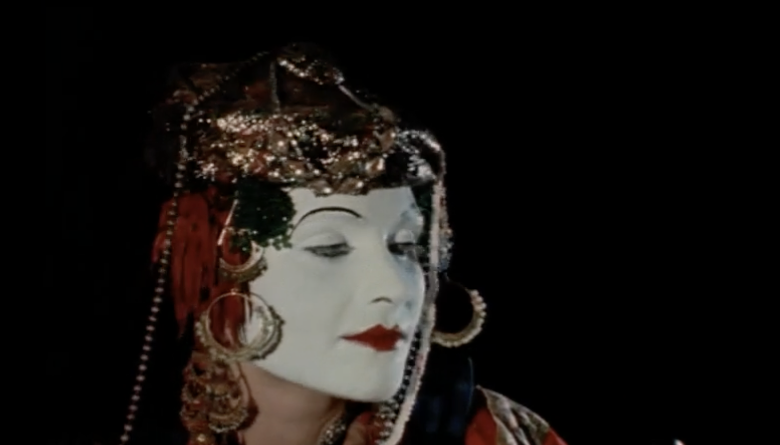
‘Isabelle Eberhardt, born in 1877 in Geneva, died in 1904 in Algeria, while she was visiting the Maghreb disguised as a man. She related her journeys in numerous writings published after her death. Several of Leslie Thornton’s projects are based on the surprising career of this explorer. There Was An Unseen Cloud Moving is the first sequence based on this research. Her interest in this historical figure is part of the overall questioning of gender issues in her work and the role of women in society, as well as on the emergence of modernity and the notion of documentation that resulted from it, in the form of photographs, films and other media. The film uses fragments, forming a collage of reconstitutions of various actresses playing the heroine, archives from the era, but also press photographs, documents, extracts from films and so on. By presenting interventions of several actors playing the same character, the spectator is directly confronted with the problematics of representation. The different faces of the actors are superimposed, destroying the identification mechanism inherent to the film, which obliterates the actor in favour of the character. This multiple portrait reveals a flaw in the possibility of a reconstitution, both on the historical and the personal level.’ — New Media
Peggy and Fred in Hell: The Prologue, 1985
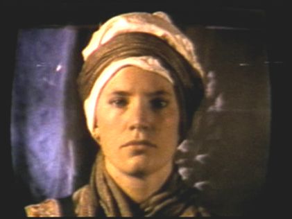
‘Peggy And Fred In Hell is one of the strangest cinematic artifacts of the last 20 years, revealing the abuses of history and innocence in the face of catastrophe, as it chronicles two small children journeying through a post-apocalyptic landscape to create their own world. Breaking genre restrictions, Thornton uses improvisation, planted quotes, archival footage and formless timeframes to confront the viewer’s preconceptions of cause and effect. “At its most distinctive, as in the endless and eternal Peggy And Fred In Hell cycle, Thornton’s work wanders past the medium’s limits and finds the medium’s origins.” —Bill Horrigan, Wexner Center’ — collaged
Excerpt
Select scenes
Jennifer, Where Are You?, 1981
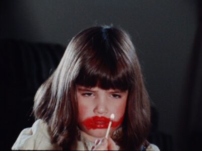
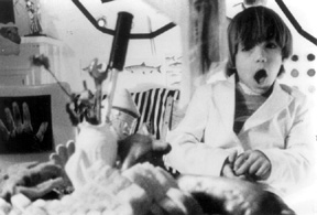
‘Jennifer, Where Are You? is structured by a speech-act, a constant proleptic call, a man’s voice which has been edited and recut into a repetitive and pervasive presence. The insistence of this male voice, which repeats the phrase “Jennifer! Where are you?” every 30 seconds, parodies the authority conceded to voice-overs in the cinema. The voice is patriarchal, relentless, and runs the entire length of the film. Cut-aways to a small girl, glancing at the camera as she plays with lipstick and matches, reapportion the relation between patriarchal phonocentrism and masculine gaze. But is this small child subject to either? No. Not really. There she is, hiding in plain sight–ours, not ‘his’–a ‘purloined subject’ successfully evading subjugation through response or acquiescence. ‘Jennifer,’ whoever she might be (a cipher, a pseudonymous textual marker of gendered cinematic presence) is never apprehended, and the film, for all of its suspense, simply ends.’
Excerpt
X-TRACTS, 1975
‘This was my first 16mm film, made with Desmond Horsfield. For the image we created a gridded score of movements, both within the frame (‘subject moves right to left’) and between the camera and the subject (zooms, pans, tilts…,) using this as a shooting script. The sound was derived from an old journal, read out loud and then cut-up into the same units of time as the image, ranging from 3 seconds to 1/4 second. Assembling the material was largely mechanical, following the predetermined score. That a tonal portrait of a person emerges was an after effect; we thought of the film as a structural or indexical system of sound/image relations, and viewed the soundtrack as a linguistic experiment, working with the building blocks of speech.’
Excerpt
*
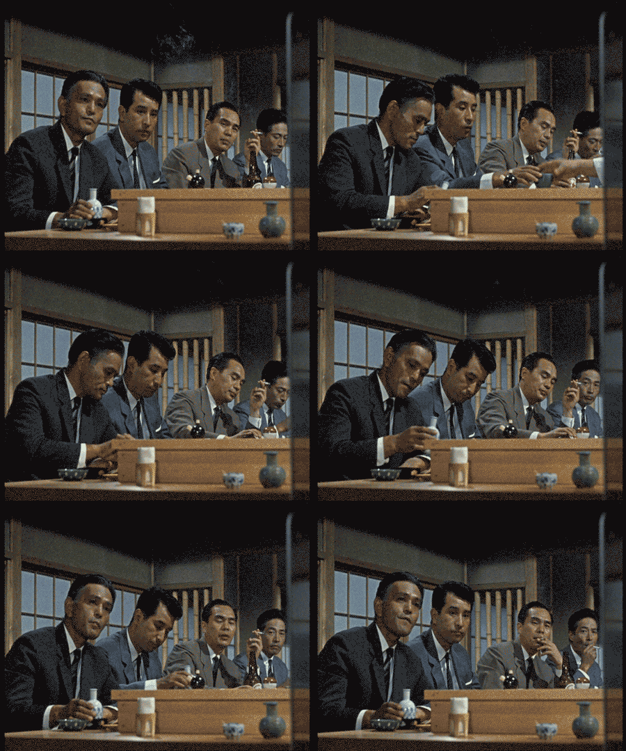
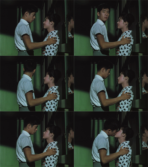
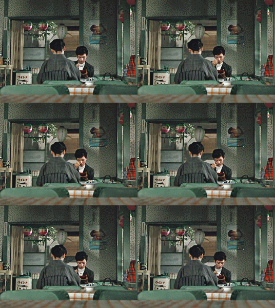
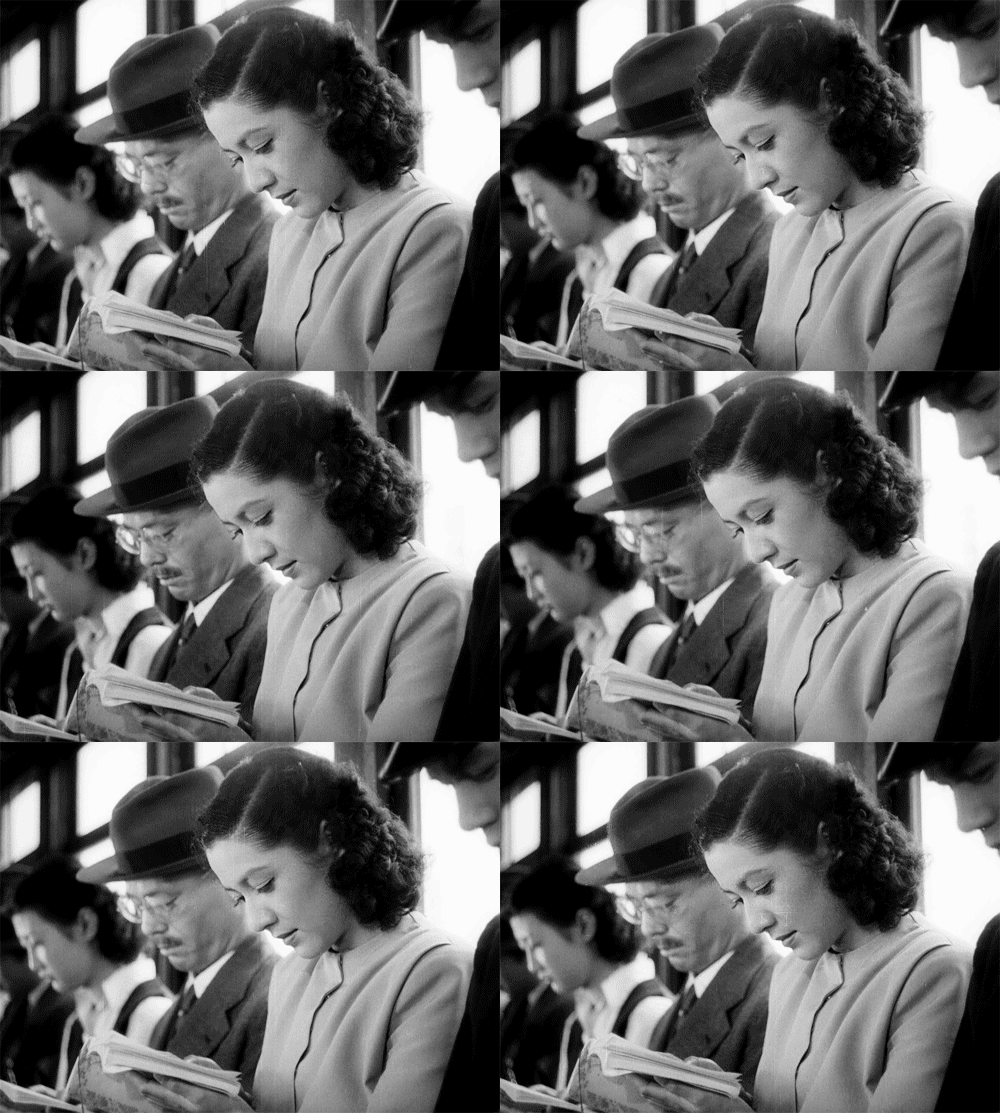
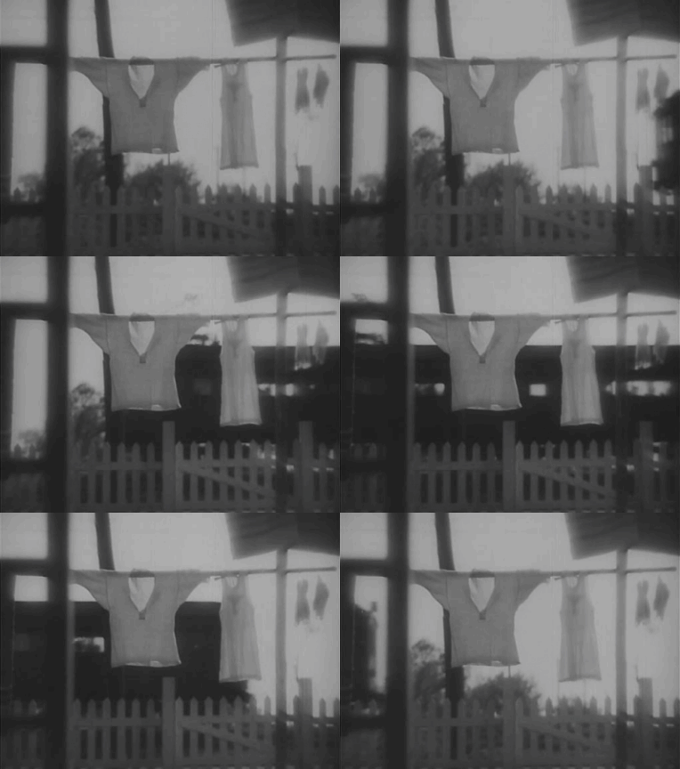
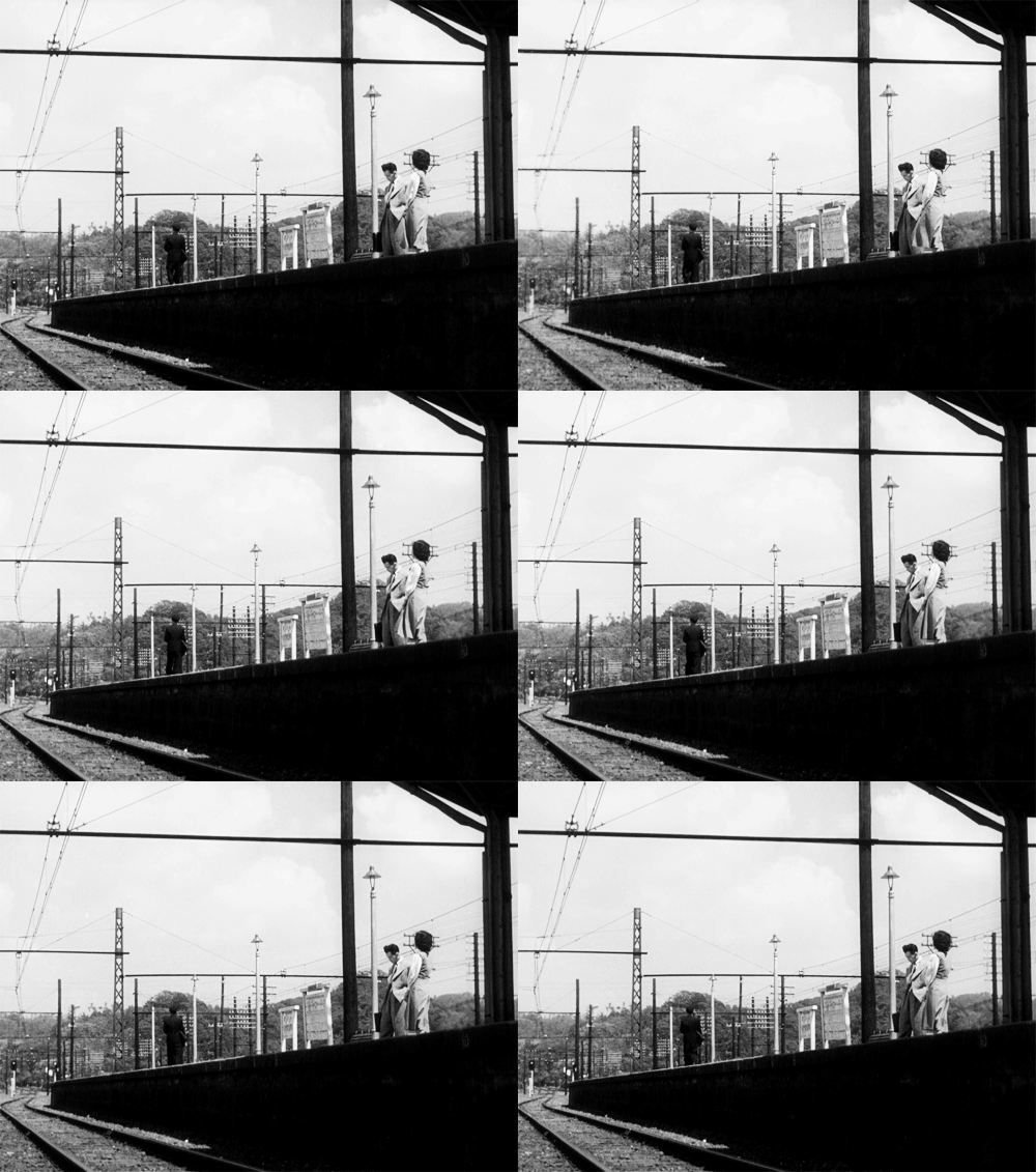
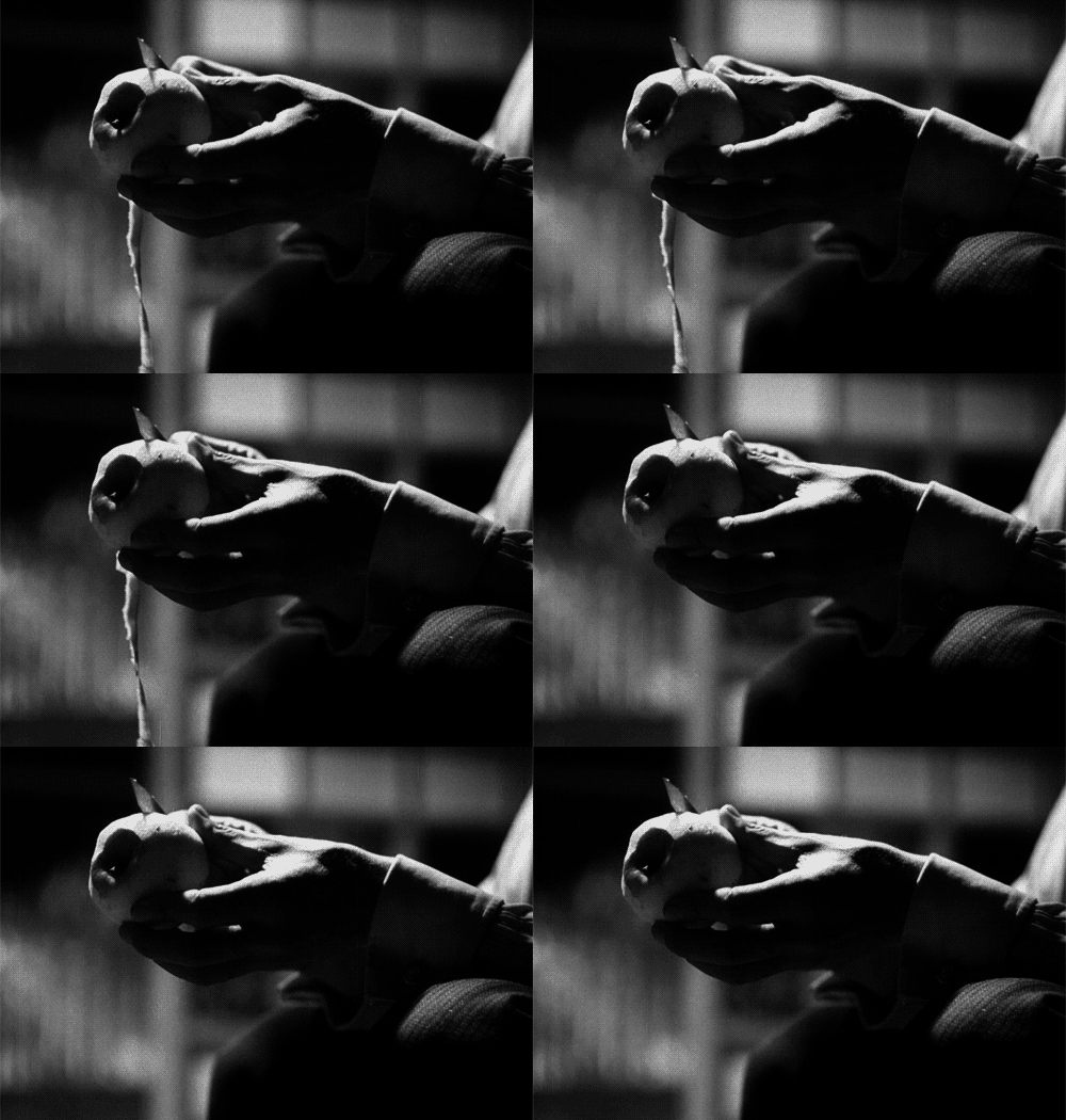
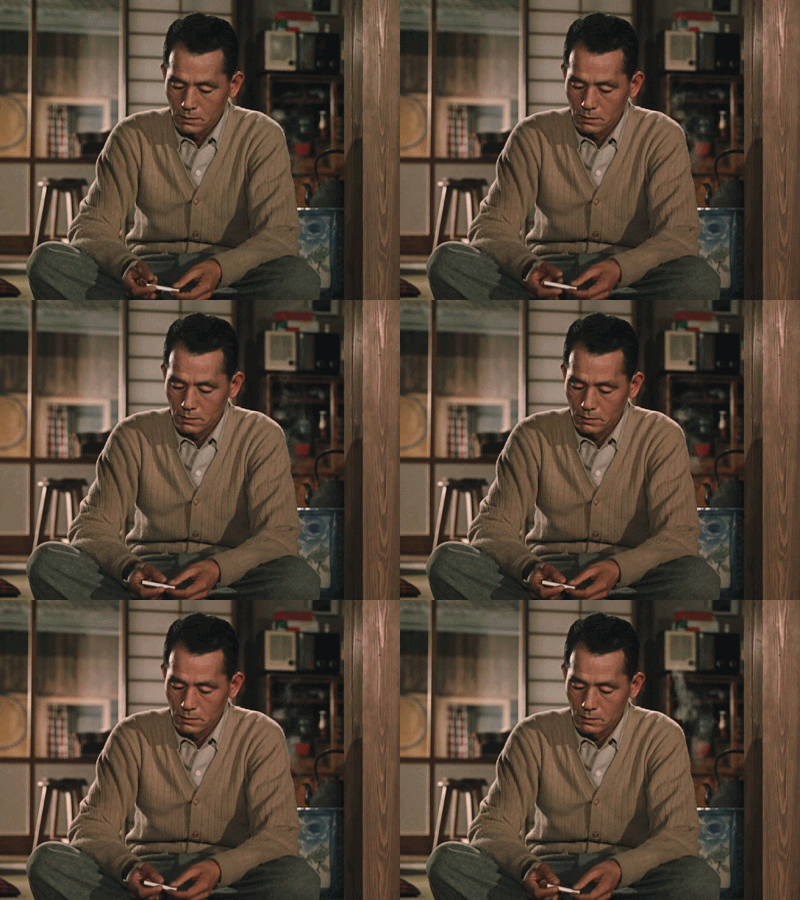
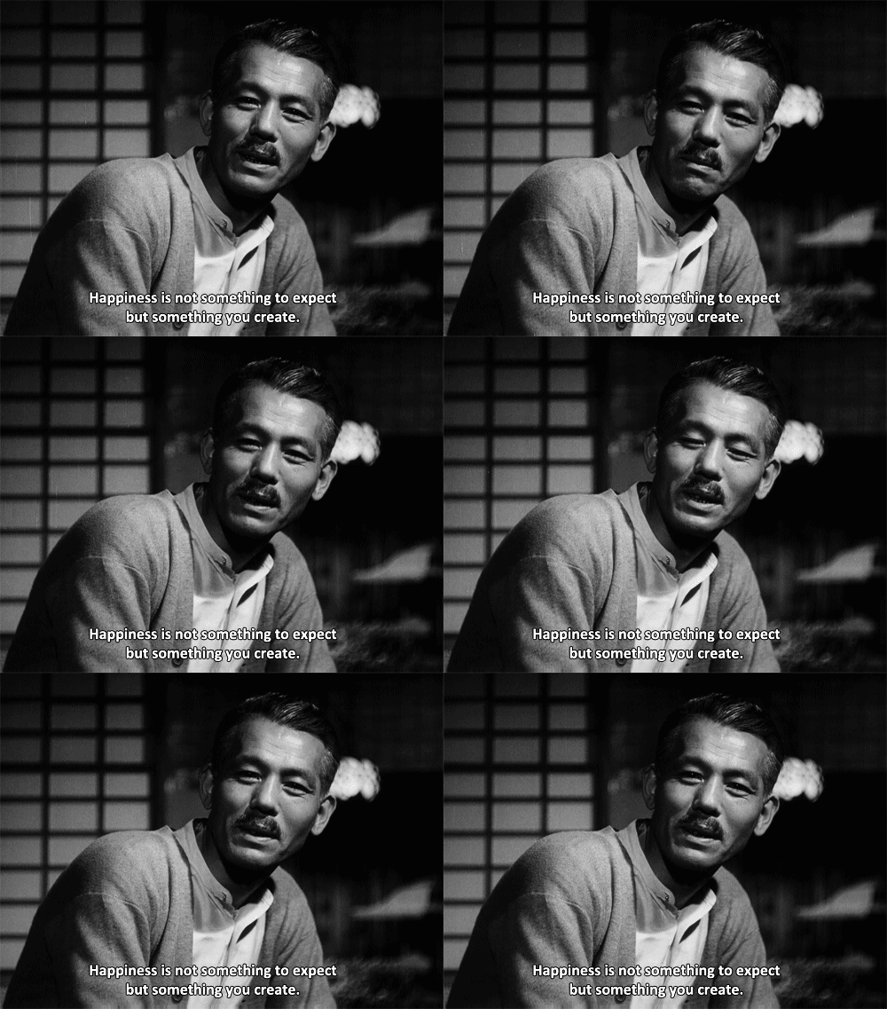
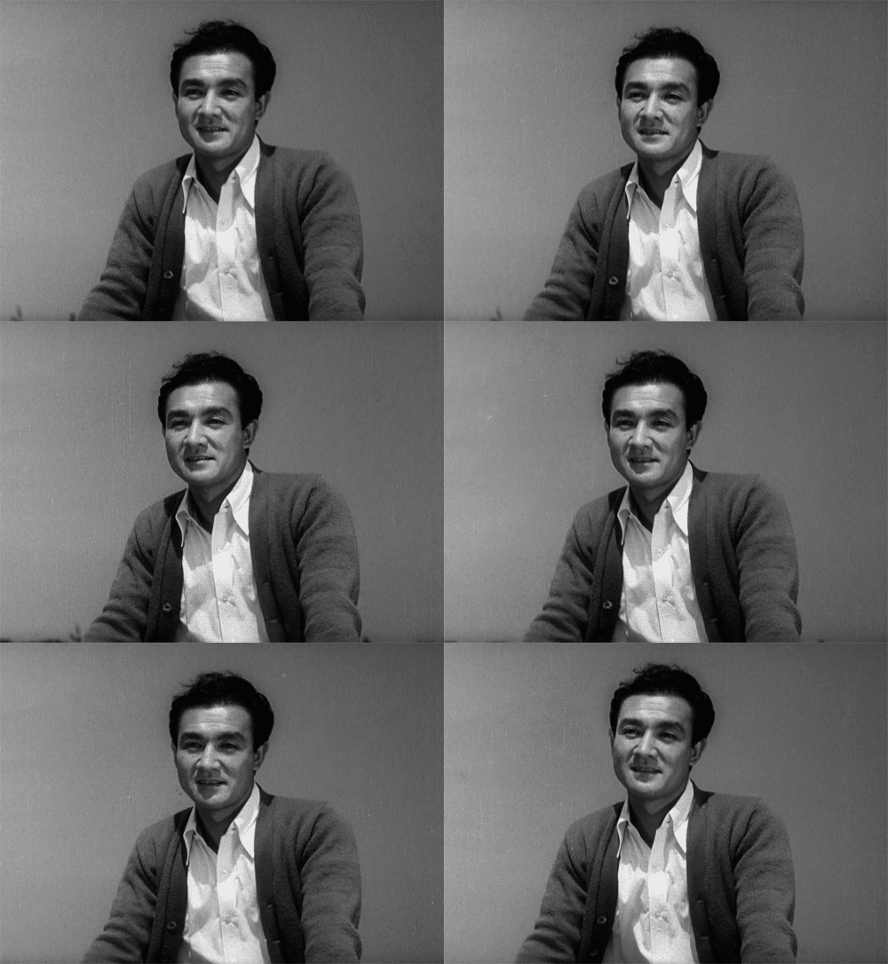
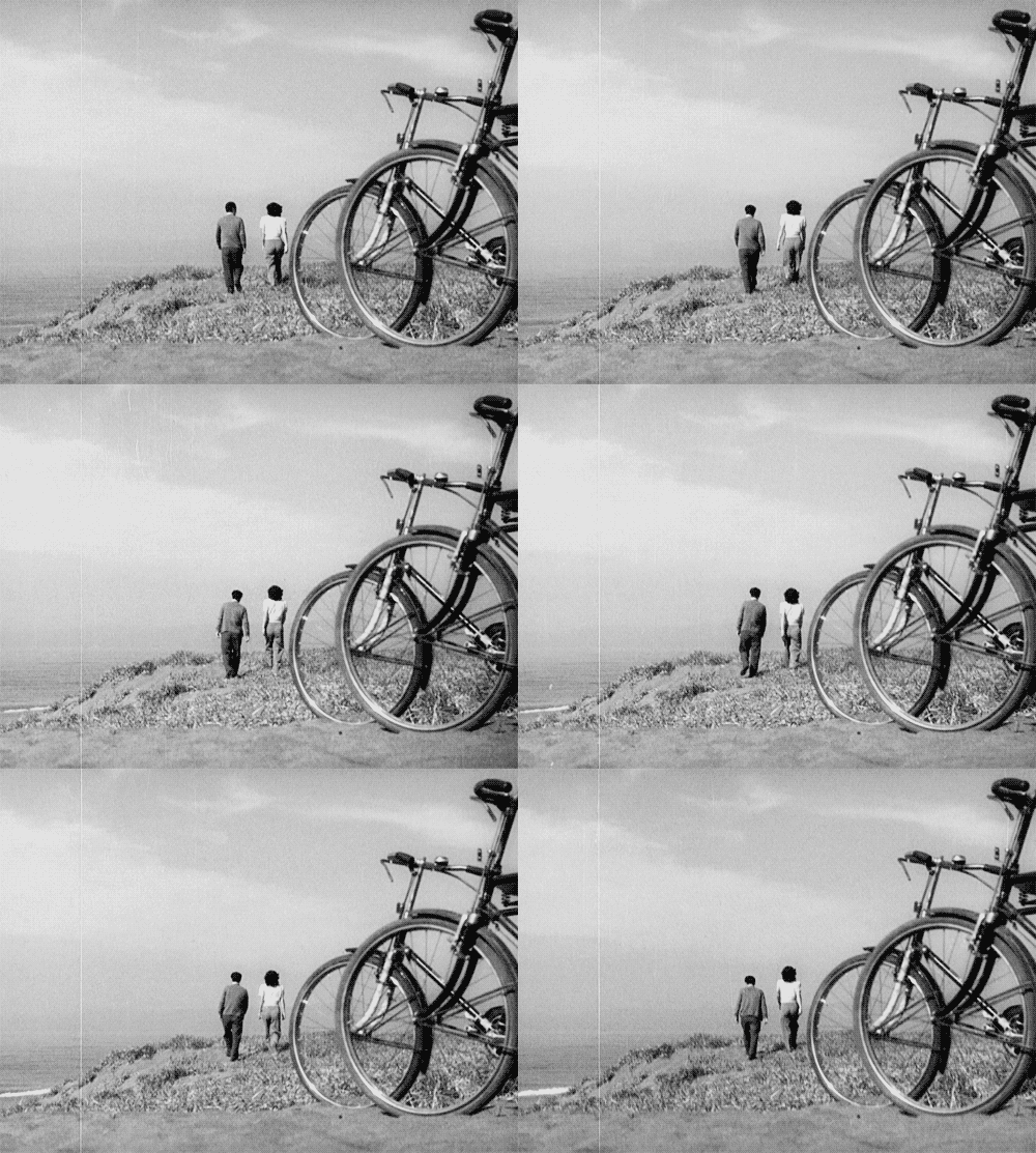
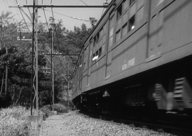
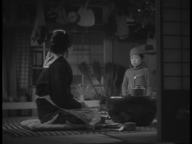
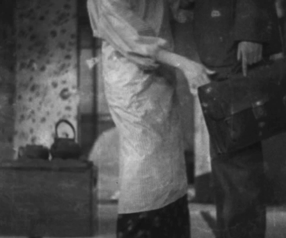
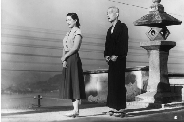
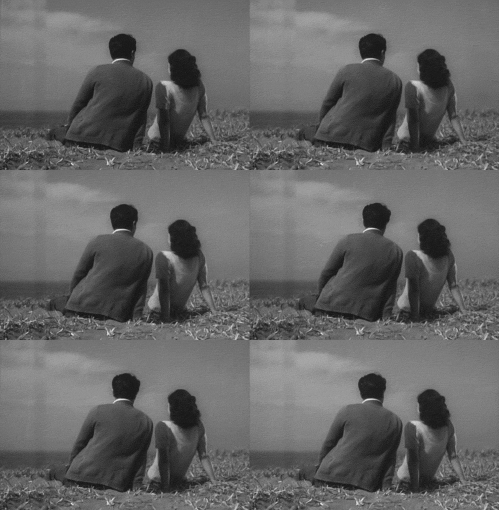
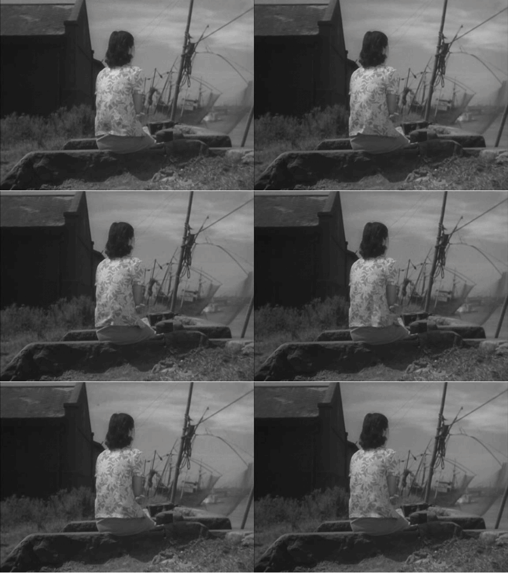
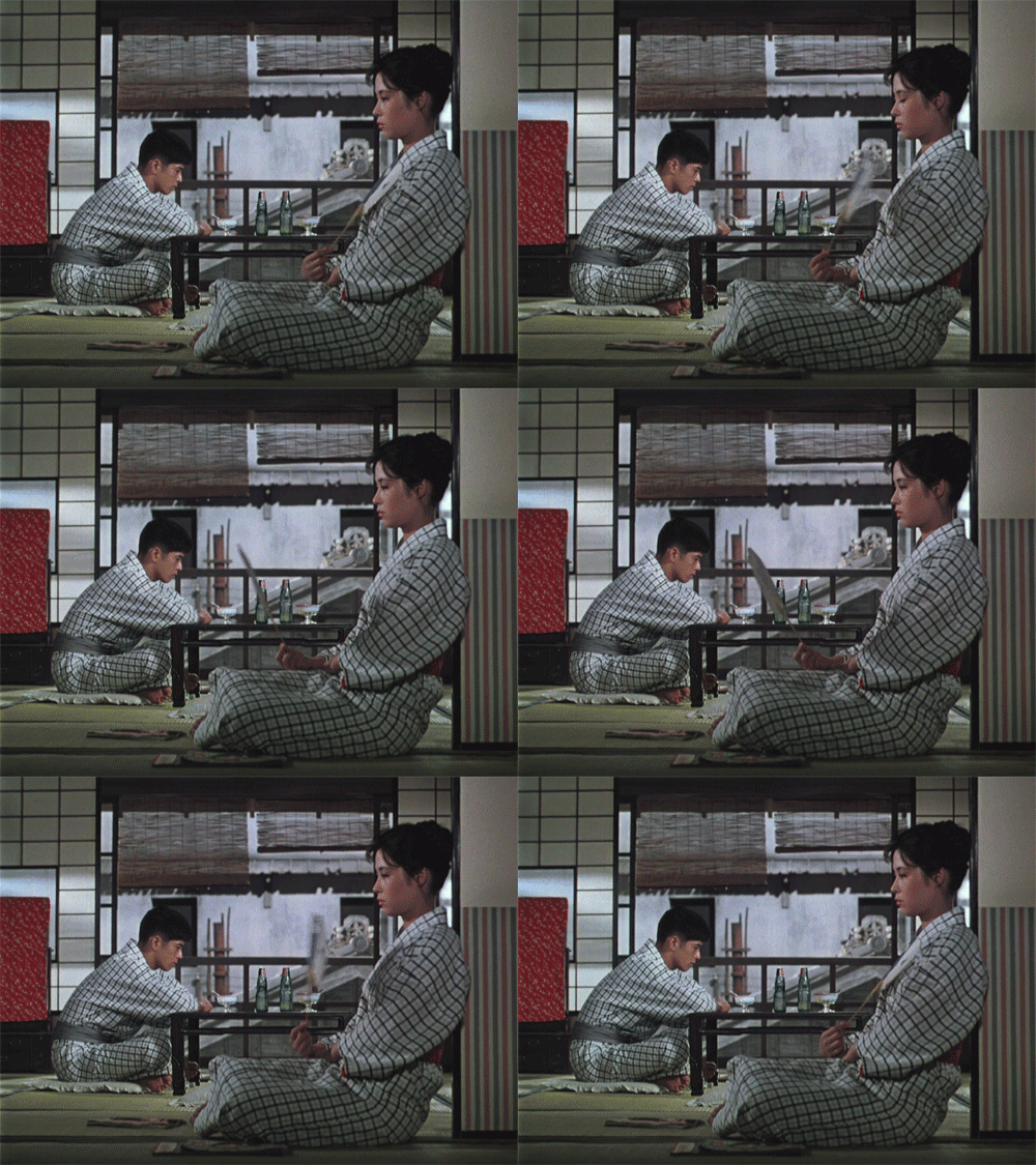
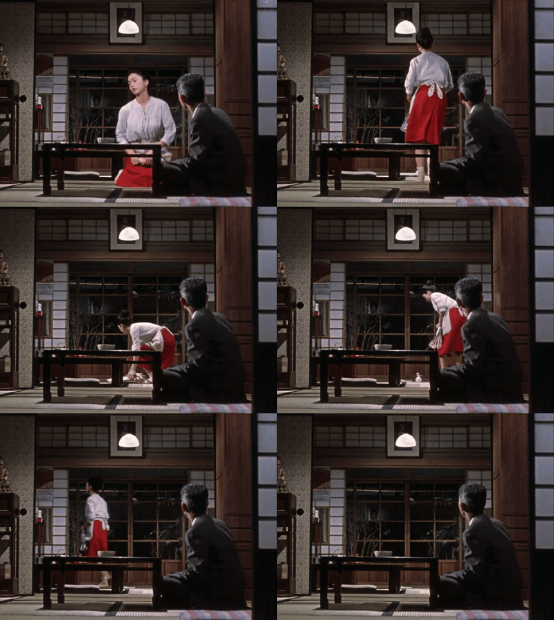
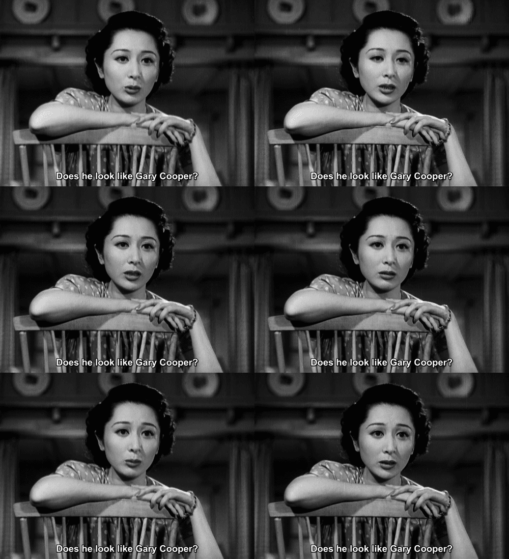
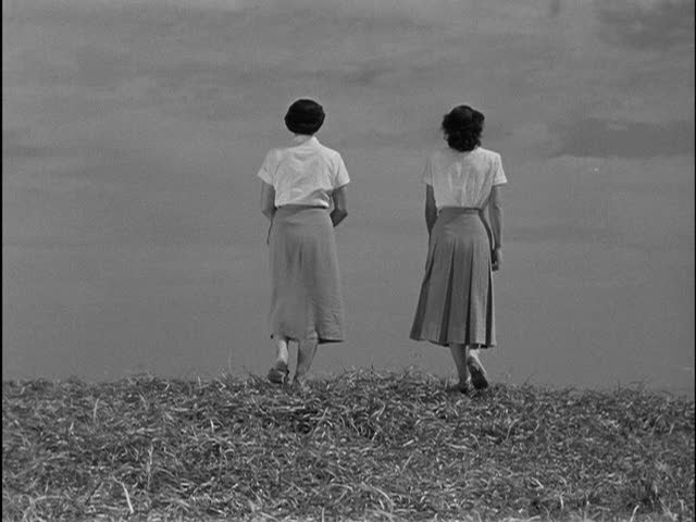
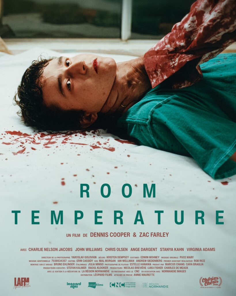
p.s. Hey. ** Dominik, Hi!!! Yes, fingers very crossed about the festivals, and thank you. I know, ‘I caved’. So good. I envied whoever wrote it, I mean, um, for his linguistic skills. I fear love may not triumph over nature in this case based on the speed with which the sky is heating up already this morning. Alas. Ooh, nice love like a mobius strip. Love upgrading the crappy seats I had no choice but to just buy for a Playboy Carti concert, G. ** David Ehrenstein, I have many Ozu faves, but ‘Late Spring’ is my #1. ** Tosh Berman, Yep, yep, and yep again. ** Misanthrope, Don’t count out those crazy talented young’ns who sometimes burst through the pack at these kinds of things. Yeah, our week is going be a hottie too. The last desperate burst from a generally pretty friendly summer, oh well. So did Lil D’s attentive tennis match observing magically turn him in to one of those crazy talented young’ns? ** Steve Erickson, No matter what, I’m just happy that Korine is back to causing trouble again. Fuck knows indie film du jour desperately needs that. Heat wave here too, but no air conditioning to save me. ** Nick., Hi, N. Awesome: your weekend’s mysterious upbeatness. Mine was just work and not work. Last night I had a big bowl of rice with mushroom sauce and shredded tofu and some scrambled up veggies and a couple of crumbled falafels mixed in. Not bad. A little boring though, it’s true. ** John Newton, Hi. I’m sure I’ll be sharing our film’s ups ands downs here seeing as how the film in my entire life for the next while. I don’t know Cruz de Malta yerba mate, but I’ll see what it is. Sounds pretty up my alley. Interesting post-college sojourn you had there. As I’ve said, I’ve never had an actual real job. I started doing journalism and record/movie/book reviews in high school, and that was my low income for a long time. Best of luck with the taxes thing. I’m miserable at taxes and always years behind and in trouble. ** ellie, Hi! My favorite is actually ‘Late Spring’, strangely enough. His films are difficult, at least in the sense that they’re very, very what they are, and you have to either sort of surrender to his style or not. As you may know, most of his films are shot from the prayer position — that is, he has the cameraperson sit on the floor in a prayer position and shoot everything from there. That gives his films a very particular quality. I don’t think you did tell me that about the publishing house. You read French?Envy/guilt. It sounds kind of okay really, the gig. Where’s the link? Sorry, I don’t understand. I’d love to see the piece. Films are very hard to make, at least when you’re used to writing novels like me. When it will show depends on things that are out of our control. Initially, which if any festival accepts it. That’s what starts the ball rolling. Thanks, ellie! Have a swell today. ** Zak, I think Ozu is pretty available DVD/Bluray-wise in France, but I’m not 100% sure. Thanks about the financial woes. Yeah, it’s very fucked. We’re soldiering on as best we can. Doing a Crowdfunding thing is sort of a last ditch. If we don’t get one of the grants we applied for, we’ll have no choice. But I really don’t want to, and neither Zac nor I are social media/self-promoting types at all, so it’s not a good fit. Maybe we will, but I hope not. Of course it’s great you’re back in the publishing saddle. And I’m curious to see your films. Are any of them seeable? There are a number of very good experimental film festivals. The one based in Paris, Festival des Cinémas Différents et Expérimentaux de Paris, is excellent. I’ve seen great things there. Warmest of the warm to you, man. ** _Black_Acrylic, ‘Tokyo Story’ is his most famous film, and it’s really great, so you won’t start wrong if you start there. He’s the kind of filmmaker, like Bresson, where if you watch one of his films, you’ll know whether you want to go further because his films are all in kind of the same style/register. ** Sypha, Hi, J. Thanks for checking in from out there in nature. I just restored an old post of yours that’ll pop up here not next Saturday but the following one. I’ll let you be surprised. Eek: the locals, or that one at least. I figured you’d hit the mini-golf course. Sigh, plaintive sigh. Congrats on the hole in 1! Yeah, the mini-golf courses over here are so pathetic I don’t even bother. I’m hanging in there, or, well, in here, I guess. Have a continuing blast! ** Corey Heiferman, Hey, Corey. Weirdly, I remember that ‘TS’ scene too. Huh. I never check a bag when I travel unless it’s an extreme emergency. I just wear the few clothes I have much longer than I should. Yeah, you probably know that Frankfurt is not physically pretty whatsoever. It was bombed in the war, and it was not rebuilt in a beautiful way. But there’s stuff there. I met Amy Halpern once or twice, and it was memorable, yes, and I like her work. That sounds really, really fun, man. ** Cody Goodnight, Hi, Cody. I’m ok. I had a day off from editing and am slightly raring to go again today. ‘Late Spring’ is my favorite. It’s hard to go wrong with him. I wouldn’t start with the very earliest ones, is all. It took him a few films to find his style, sort of like Bresson. I’m fond of ‘King of the Hill’ too. I never could get into ‘Futurama’. I know a lot of people who love it though. I know Pharaoh Sanders’ work, but I’m not sure if I know that particular album. I’ll find out. I saw him play live once. It was great, of course. I hope Monday is beginning on a high note for you. ** Right. Today I present a galerie show of works by the awesome media/video artist and filmmaker Leslie Thornton that I hope you will find to be of interest, naturally. See you tomorrow.



























 Now available in North America